


Software architecture is often difficult to grasp without visual aids. Text alone cannot convey the complexity of a distributed system or the flow of data between services. This is where the C4 model steps in. It provides a structured approach to creating software architecture diagrams. By focusing on different levels of abstraction, teams can communicate complex ideas effectively.
The C4 model is not about creating pretty pictures. It is about clarity. It helps architects, developers, and stakeholders understand the system structure without getting lost in implementation details. Whether you are designing a new microservice or documenting an existing monolith, this method offers a consistent framework.
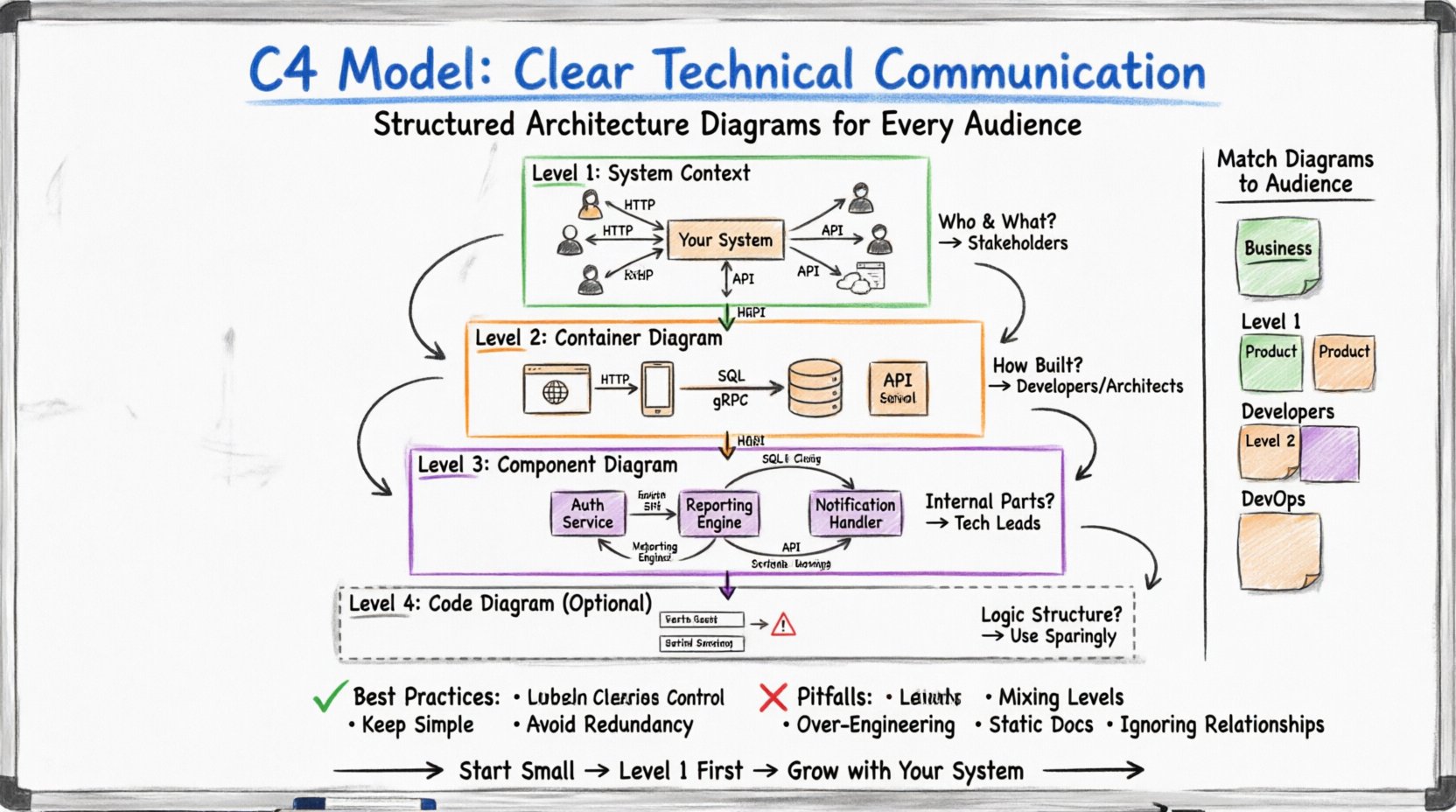
📊 Why Use a Structured Diagramming Approach?
Without a standard, every developer draws diagrams differently. One person might show every class, while another shows only high-level services. This inconsistency creates confusion. A shared model ensures that everyone speaks the same language.
- Consistency: Everyone follows the same rules for shapes and labels.
- Scalability: You can zoom in and out without losing context.
- Onboarding: New team members understand the system faster.
- Maintenance: Updates are easier when the structure is clear.
The model organizes information into specific layers. This prevents the common mistake of mixing high-level business logic with low-level database queries in a single view.
🗺️ The Hierarchy of Abstraction
Understanding the levels is crucial. Each level answers a different question. The following table outlines the focus of each diagram type.
| Level | Diagram Name | Key Question | Target Audience |
|---|---|---|---|
| Level 1 | System Context Diagram | What is the system and who uses it? | Stakeholders, Managers |
| Level 2 | Container Diagram | How is the system built? | Developers, Architects |
| Level 3 | Component Diagram | What are the internal parts? | Developers, Technical Leads |
| Level 4 | Code Diagram (Optional) | How is the logic structured? | Developers, Code Reviewers |
🌍 Level 1: System Context Diagram
The System Context diagram is the starting point. It places your system in the world. It does not show internal details. Instead, it focuses on the boundary of the system and its interactions with the outside world.
🔍 What Goes Into This Diagram?
- The System: Represented as a single box. This is your main application or service.
- People: Users or roles who interact with the system. Icons like humans or silhouettes work well here.
- External Systems: Other software that your system talks to. These could be payment gateways, email providers, or third-party APIs.
- Relationships: Lines connecting the system to people and other systems. Labels on these lines explain the data flow.
This level is perfect for explaining the scope of a project. It answers the question: “Does this system need to talk to the legacy database?” or “Who is responsible for logging into this portal?”
🎯 When to Use It
- During project kick-offs to define scope.
- When explaining the system to non-technical stakeholders.
- For high-level risk assessment regarding external dependencies.
🖥️ Level 2: Container Diagram
Once the context is clear, you can zoom in. The Container diagram reveals how the system is built. A container is a deployable unit of software. It holds code and data. It is distinct from a component because it is a physical runtime environment.
🔍 What Are Containers?
Containers are not Docker containers in this context. They are broader categories. Examples include:
- Web Applications: Websites built with frameworks like React, Angular, or server-side templates.
- Mobile Applications: iOS or Android apps running on user devices.
- Database Systems: SQL or NoSQL databases storing persistent data.
- API Services: Backend services exposing endpoints.
- Batch Jobs: Scheduled tasks that run in the background.
🔗 Relationships Between Containers
Just like the System Context, you must show how containers talk to each other. Use arrows to indicate direction. Label the protocol or language used. Examples include HTTP/HTTPS, gRPC, or SQL queries.
This level helps developers understand deployment topology. It answers: “Is the database on the same server as the web app?” or “Do we need a separate API gateway?”
🎯 When to Use It
- During architectural design reviews.
- When planning infrastructure changes.
- To identify security boundaries between services.
⚙️ Level 3: Component Diagram
Inside a container, the logic is often too complex to be a single block. The Component diagram breaks down a container into logical parts. These parts are not physical files. They are cohesive groups of functionality.
🔍 What Is a Component?
A component is a logical unit of code. It might be a service, a module, or a library. It is defined by what it does, not where it lives on the disk. Examples include:
- Authentication Service: Handles user login and session management.
- Reporting Engine: Generates PDFs or charts.
- Notification Handler: Sends emails or push notifications.
- Data Access Layer: Manages database interactions.
🛠️ Internal Connections
Components interact with each other. You should show these interactions clearly. Use interfaces to indicate how components connect. This helps developers understand dependencies.
For example, the Reporting Engine might depend on the Data Access Layer to fetch information. The Authentication Service might depend on the User Profile Component to retrieve details.
🎯 When to Use It
- When onboarding new developers to a specific service.
- During code refactoring sessions.
- To document internal APIs between modules.
📝 Level 4: Code Diagram (Optional)
While the official model focuses on the first three levels, some teams extend to code. This level is rarely recommended for documentation unless the system is extremely complex. It shows classes, interfaces, and functions.
⚠️ Caution
Code diagrams can become outdated very quickly. Every time a variable is renamed or a method is moved, the diagram breaks. Use this level sparingly.
- Use Case: Explaining complex algorithms or specific class hierarchies.
- Best Practice: Generate these automatically from code rather than drawing them manually.
👥 Matching Diagrams to Audiences
One of the strengths of the C4 model is audience alignment. You do not show the same diagram to everyone. Different roles need different levels of detail.
| Audience | Recommended Level | Why? |
|---|---|---|
| Business Stakeholders | Level 1 | Focus on value and external dependencies. No technical jargon. |
| Product Managers | Level 1 & 2 | Understand the system boundaries and major building blocks. |
| Developers | Level 2 & 3 | Need to know how to build, deploy, and connect the parts. |
| DevOps Engineers | Level 2 | Focus on deployment units and infrastructure needs. |
🛠️ Best Practices for Documentation
Creating diagrams is one thing. Keeping them useful is another. Follow these guidelines to ensure your documentation remains valuable over time.
1. Keep It Simple
- Do not clutter the diagram. If a line crosses too many other lines, the diagram becomes unreadable.
- Use consistent shapes for types of systems. Always use a cylinder for databases and a box for applications.
- Avoid showing every single class in a container. Focus on the top-level logical groups.
2. Label Clearly
- Every box needs a name. Every line needs a label explaining the data flow.
- Use standard protocols for labels (e.g., HTTP, TCP, SQL). This ensures technical accuracy.
- Do not leave arrows unlabeled. Direction matters.
3. Version Control Your Diagrams
- Treat diagrams like code. Store them in the same repository as your source code.
- Commit changes when the architecture changes. This creates a history of evolution.
- Use text-based formats where possible. This allows for easier merging and diffing.
4. Avoid Redundancy
- Do not copy the same information across all levels. Level 1 should not contain the details of Level 3.
- Ensure each level adds new information. If the Container diagram is the same as the Context diagram, it is not useful.
🚫 Common Pitfalls to Avoid
Even experienced teams make mistakes when adopting this model. Be aware of these common traps.
- Mixing Levels: Putting database tables in a Container diagram. Containers hold databases, but the tables inside are components or code.
- Over-Engineering: Trying to diagram every single microservice immediately. Start with the critical paths.
- Static Documentation: Creating a diagram once and never updating it. An outdated diagram is worse than no diagram.
- Ignoring Relationships: Focusing on boxes and forgetting the lines. The flow of data is often more important than the storage.
🔄 Integrating Into Your Workflow
How do you fit this into daily work? It should not be a separate task done once a month. Integrate it into the development lifecycle.
During Planning
When a new feature is proposed, update the System Context or Container diagram if the scope changes. This ensures the team agrees on the architecture before writing code.
During Code Review
When a developer adds a new service, they should update the Container diagram. This keeps the documentation synchronized with the code.
During Retrospectives
Review the diagrams to see if the architecture is evolving as expected. If the diagrams look messy, it might indicate technical debt.
📈 Benefits for Team Collaboration
Beyond technical clarity, this approach improves how teams work together.
- Shared Vocabulary: Everyone agrees on what a “Container” is. No more debating if a folder is a service.
- Faster Onboarding: New hires can read the diagrams to understand the system without reading thousands of lines of code.
- Better Decisions: Visualizing the system helps identify bottlenecks or single points of failure early.
- Reduced Knowledge Silos: Documentation is accessible to everyone, not just one senior developer.
🧭 Moving Forward
Adopting a structured approach to architecture documentation is a long-term investment. It requires discipline to maintain the diagrams. However, the payoff is significant. Teams communicate faster, make fewer mistakes, and build systems that are easier to understand.
Start small. Pick one system. Create a Level 1 diagram. Then expand to Level 2. Do not try to document everything at once. Let the documentation grow with the system.
Remember, the goal is communication, not perfection. A rough diagram that explains the idea is better than a perfect diagram that no one reads. Focus on clarity and accuracy. Ensure the visual representation matches the reality of the running system.
By following these principles, you create a living library of knowledge. This library serves as the backbone for your technical discussions. It turns abstract ideas into concrete structures that anyone can understand.
Take the time to learn the model. Practice drawing the diagrams. Share them with your team. Over time, you will find that your architecture reviews become more efficient and your code becomes more modular. This is the true value of clear technical communication.

