


Software architecture documentation often falls into a trap. Teams create complex diagrams that look impressive but communicate little. These images become outdated quickly, confusing new team members rather than helping them. The goal of architecture documentation is not to create art. It is to convey information clearly. This is where the C4 model comes into play. It provides a structured way to visualize software systems without getting lost in the weeds.
When you build software, you are building mental models for others. A good diagram reduces cognitive load. It helps stakeholders understand the big picture. It helps developers understand the details. The C4 model offers a hierarchy of abstraction. This allows you to tailor the view based on who is looking at it. Whether you are talking to a product manager or a senior engineer, there is a diagram level that fits.
📐 Why Standard Diagrams Often Fail
Before diving into the model, it helps to understand the problem it solves. Traditional Unified Modeling Language (UML) diagrams are often too detailed. They focus on code-level relationships like inheritance or association. This works for specific classes but fails for system landscapes. On the other hand, simple box-and-arrow sketches often lack consistency. Everyone draws them differently. This leads to confusion when reading multiple documents.
Consistency is key. The C4 model enforces a standard notation. It uses the same shapes and colors across different levels. This creates a shared language for the team. It also focuses on the “why” and the “what” rather than just the “how”. This shift in perspective changes how teams approach documentation.
- Consistency: Everyone uses the same symbols.
- Abstraction: You can zoom in or out without breaking the view.
- Clarity: Focus on external relationships before internal logic.
- Maintainability: Easier to keep up to date as the system evolves.
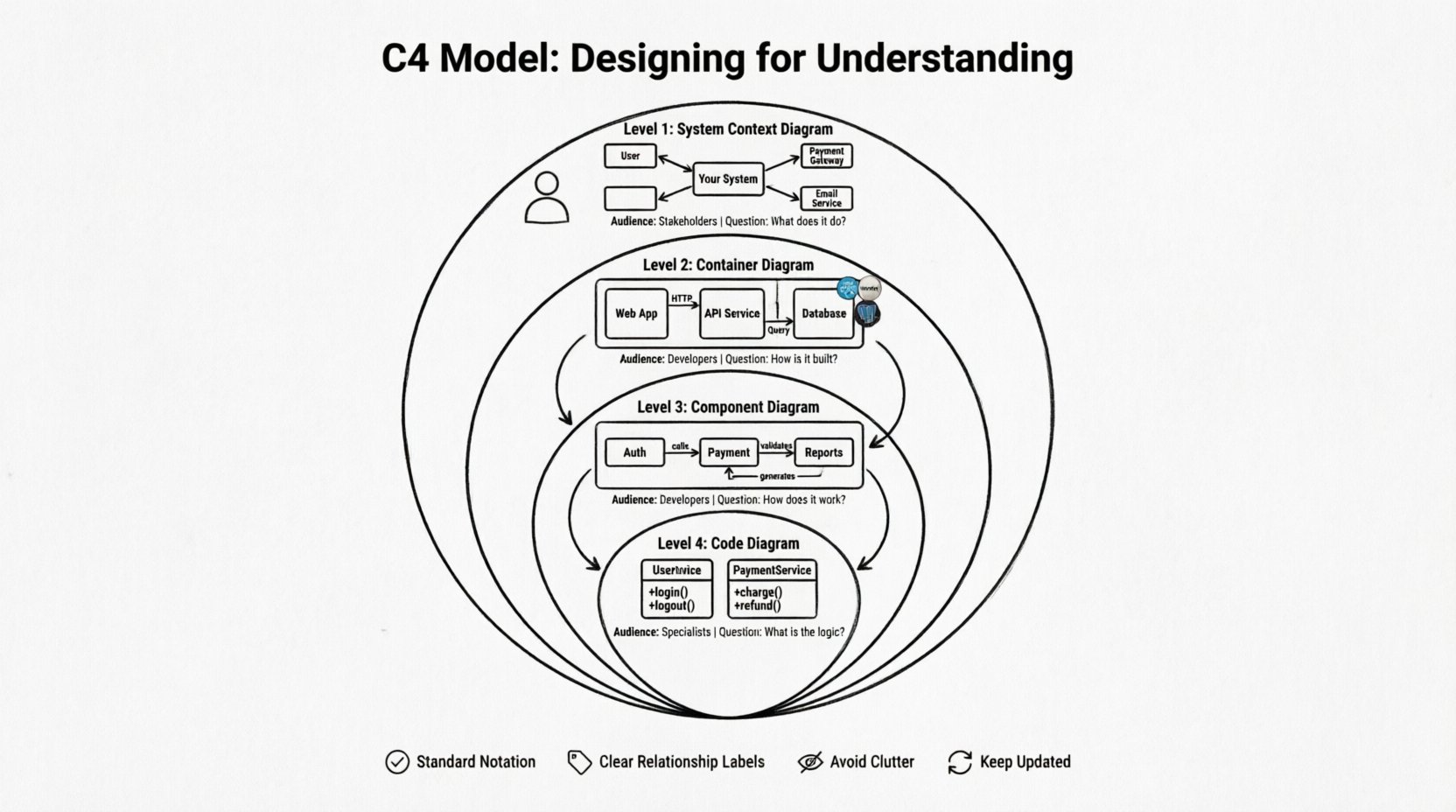
🗺️ The Four Levels of Abstraction
The core of the model is its four levels. Each level answers a different set of questions. You do not need to draw all four levels for every project. You choose the level that matches the audience and the question at hand. The levels move from the outside in. They start with the context of the system and drill down into the code.
1️⃣ Level 1: System Context Diagram
This is the highest level view. It shows the system you are designing as a single box. It places that system within the broader landscape. This diagram is primarily for stakeholders. It answers the question: “What does this system do and who uses it?”
- People: Represented as stick figures. These are the users or actors interacting with the system.
- Systems: Represented as boxes. These are other software systems that integrate with yours.
- Relationships: Arrows showing data flow or interaction between the system and the external entities.
This diagram does not show internal details. It does not show servers, databases, or microservices. It treats the entire system as a black box. This is intentional. It prevents the audience from getting bogged down in implementation details before they understand the value proposition.
2️⃣ Level 2: Container Diagram
Once the context is clear, you break the system down into containers. A container is a deployable unit. It could be a web application, a mobile app, a microservice, or a database. This level answers the question: “How is the system built?”
- Technology: You should label the technology stack. For example, “Java Spring Boot”, “React Frontend”, “PostgreSQL”.
- Boundaries: Containers have clear boundaries. They show how different parts of the system are separated.
- Communication: Arrows show how containers talk to each other. Is it over HTTP? Is it a database query?
This level is crucial for developers. It sets the boundaries for deployment. It clarifies where responsibilities lie. If a system has multiple containers, this diagram shows the architecture clearly. It avoids the complexity of code while still showing technical choices.
3️⃣ Level 3: Component Diagram
Inside a container, there is logic. This level zooms into a single container. It breaks that container down into components. A component is a logical grouping of functionality. It is not a specific class or file. It is a cohesive piece of business logic.
- Functionality: Components represent features or modules. For example, “User Authentication”, “Payment Processing”, “Report Generation”.
- Relationships: Shows how components interact within the container.
- Scope: This diagram is usually limited to one container. You do not draw the whole system here.
This level helps developers understand the internal structure. It is useful for onboarding new team members. It clarifies which part of the code handles which business rule. It bridges the gap between the high-level container view and the low-level code view.
4️⃣ Level 4: Code Diagram
This level is optional. It shows specific classes, methods, and functions. It is the most detailed level. Most teams do not need to maintain diagrams at this level. Code comments and IDE features often serve this purpose better. However, it can be useful for complex algorithms or specific integration points.
- Detail: Shows class names and method signatures.
- Usage: Use this only when necessary for complex logic.
- Maintenance: High maintenance cost. Easy to become outdated.
📊 Comparing the Levels
Understanding the differences between levels is vital. Each level serves a specific purpose. You can use the table below to decide which level to draw.
| Level | Name | Primary Audience | Key Question |
|---|---|---|---|
| 1 | System Context | Stakeholders, Managers | What does it do? |
| 2 | Container | Developers, Architects | How is it built? |
| 3 | Component | Developers | How does it work? |
| 4 | Code | Developers (Specific) | What is the logic? |
🛠️ Best Practices for Effective Diagrams
Creating a diagram is one thing. Creating a useful one is another. The following practices help ensure your documentation remains valuable over time.
📍 Use Standard Notation
Do not invent your own shapes. Stick to the standard shapes defined in the C4 model. This ensures that anyone familiar with the model can read your diagram immediately. Deviating from the standard creates friction. It forces the reader to decode your specific legend.
📍 Label Relationships Clearly
Arrows should not just point from A to B. They should explain the data flow. Use labels on the lines. Examples include “User Data”, “Order Request”, or “API Response”. Context is lost without labels. A line without text is ambiguous.
📍 Avoid Clutter
If a diagram has too many boxes, it becomes unreadable. This is often called “spaghetti”. If you have too many components, split the diagram. Create a summary view and a detail view. It is better to have multiple focused diagrams than one massive map.
📍 Keep It Updated
Documentation is useless if it is wrong. If the code changes, the diagram must change. Treat diagrams as code. Version control them. Integrate them into the build process if possible. If you cannot keep them updated, do not create them.
⚠️ Common Pitfalls to Avoid
Even with a good model, teams make mistakes. Here are common errors to watch out for.
- Too Much Detail Too Soon: Starting with Level 3 or 4 before defining the context. This confuses stakeholders who need to see the big picture first.
- Ignoring the Audience: Showing code-level diagrams to business managers. They care about features, not class structures.
- Static Documentation: Creating diagrams once and never touching them again. Architecture evolves. Documentation must evolve with it.
- Over-Engineering: Drawing every single class. Focus on the significant components. Ignore the trivial details.
- Using Proprietary Symbols: Avoid custom icons unless they are universally understood within your organization.
🔄 Collaboration and Communication
The C4 model is not just for drawing. It is for talking. It provides a common vocabulary. When you say “Container”, everyone knows you mean a deployable unit like a service or database. When you say “Component”, you mean a module of logic.
This shared language reduces misunderstandings. It speeds up meetings. Instead of spending time defining terms, you can discuss the design. It helps in code reviews as well. You can point to a diagram to explain why a certain separation of concerns exists.
It also helps in decision-making. When considering a new technology, you can map it to a container. You can see where it fits in the landscape. This reduces the risk of architectural drift. It keeps the system cohesive.
📝 Maintenance Strategies
Maintaining diagrams is a challenge. The temptation is to let them rot. Here are strategies to keep them alive.
- Automate Generation: Use tools that generate diagrams from code. This ensures the diagrams always match the source.
- Code Reviews: Include diagram updates in pull requests. If the architecture changes, the diagram must change.
- Periodic Reviews: Schedule time to review architecture docs. Check if they still reflect reality.
- Simplify: If a diagram is too hard to maintain, simplify it. Remove unnecessary details.
🌐 The Value of Abstraction
The power of the C4 model lies in its abstraction layers. It allows you to communicate at the right level of detail. This is often called “zooming”. You can start at the context level to get approval. Then you zoom into containers to plan implementation. Finally, you zoom into components to write code.
This hierarchical approach prevents cognitive overload. A developer does not need to know about the external marketing system to write a payment function. They need to know the payment component. A manager does not need to know about the payment class. They need to know the payment service.
By separating concerns, you make the system easier to reason about. It separates the business view from the technical view. It separates the deployment view from the logic view. This separation is essential for complex systems.
🎨 Visual Consistency Matters
Visual design plays a role in comprehension. Consistent colors help identify types of elements. For example, always use blue for software systems. Use green for people. Use red for external dependencies. This visual coding helps the brain process the information faster.
Spacing is also important. Do not crowd boxes. Give them room to breathe. Align elements where possible. A clean layout looks professional and is easier to read. It signals that the design is thought out.
🧭 Moving Forward
Adopting a new modeling approach takes time. It requires discipline from the team. It requires a shift in mindset from “drawing” to “communicating”. However, the benefits are clear. Better documentation leads to better software. It reduces onboarding time. It reduces bugs caused by misunderstandings.
Start small. Draw a Level 1 diagram for your next project. Share it with your team. Ask for feedback. Then expand to Level 2 if needed. Do not try to do everything at once. The model is flexible. It adapts to your needs.
Remember that the goal is understanding. If a diagram does not help someone understand the system, it is not useful. Use the C4 model as a tool to achieve that clarity. Keep it simple. Keep it accurate. Keep it current.
By following these principles, you create a living documentation system. It supports the team through the lifecycle of the software. It becomes a reference point for future decisions. It turns architecture into a shared asset rather than a hidden burden.

