


Software systems have grown increasingly intricate. What once began as a monolithic script has evolved into distributed microservices, cloud-native platforms, and complex data pipelines. With this complexity comes a communication challenge. How do developers explain what they built? How do managers understand the cost and risk? How do new team members onboard without getting lost in a maze of technical jargon? 🤔
Enter the C4 Model. This approach provides a structured hierarchy for visualizing software architecture. It bridges the gap between high-level business needs and low-level implementation details. By focusing on abstraction rather than syntax, it allows teams to communicate clearly without getting bogged down in unnecessary noise. This guide explores how to apply this model effectively to improve documentation, collaboration, and system understanding.
🧩 The Problem with Traditional Diagramming
For decades, the industry relied heavily on Unified Modeling Language (UML). While UML is powerful, it often fails in modern agile environments. Why? Because UML diagrams frequently focus on static structure or detailed sequence flows that become outdated within days of creation. They require a high level of technical expertise to read, which alienates non-technical stakeholders.
Common issues with older approaches include:
- Over-engineering: Diagrams that try to show everything end up showing nothing useful.
- Lack of Context: A component diagram often exists in isolation, disconnected from the business environment.
- Maintenance Burden: Keeping detailed diagrams in sync with code is difficult and time-consuming.
- Communication Gap: Executives see a wall of boxes and arrows; developers see the logic they need.
The C4 Model addresses these pain points by enforcing a specific set of rules regarding what information belongs at each level of detail. It prioritizes readability and relevance over technical completeness.
📚 Understanding the C4 Hierarchy
The core philosophy of this model is scalability. You do not need to draw every class in your application to explain how the system works. Instead, you use four levels of abstraction. Each level answers a specific question for a specific audience.
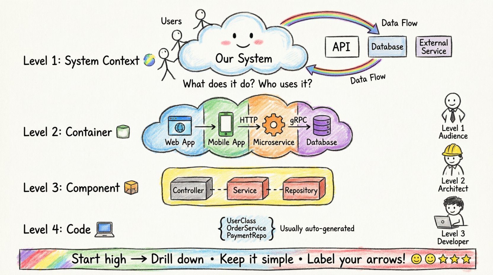
1. Level 1: System Context Diagram 🌍
At the highest level, you define the system itself and how it interacts with its environment. This is often the first diagram created during a project kickoff.
- Focus: The software system as a whole.
- Key Elements: The central system (the application), people (users), and external systems (third-party APIs, databases, legacy services).
- Relationships: Arrows indicate data flow. These are directional, showing what information moves in and out.
This diagram answers the question: “What does the system do, and who uses it?” It is ideal for business analysts, product owners, and new hires. It sets the boundaries of the project without diving into internal logic.
2. Level 2: Container Diagram 📦
Once the context is set, we zoom in to see how the system is physically deployed. A container represents a distinct runtime environment. It is a deployable unit of software.
- Focus: The technology stack and deployment topology.
- Key Elements: Web applications, mobile apps, microservices, data stores, and file systems.
- Relationships: Connections between containers show protocols (HTTP, gRPC, TCP) and data types.
This diagram answers: “What are the building blocks of this system?” It helps architects decide on technology choices and helps DevOps teams understand deployment requirements. It separates the logical function from the physical implementation.
3. Level 3: Component Diagram 🧱
Inside a container, there is often significant complexity. The component diagram breaks down a single container into its internal parts. This is where the logic lives.
- Focus: Internal structure of a specific container.
- Key Elements: Features, services, controllers, and repositories. Think of these as modules or packages.
- Relationships: Dependencies between internal parts. This shows how code modules interact.
This diagram answers: “How does the code inside this application work together?” It is primarily for developers and technical leads. It allows a team to onboard a new engineer to a specific microservice without needing to read the entire codebase.
4. Level 4: Code Diagram 💻
This is the lowest level of abstraction. It maps components to actual code classes, methods, or functions. While possible, this level is rarely used in standard documentation.
- Focus: Exact implementation details.
- Key Elements: Classes, interfaces, and methods.
- Usage: Usually generated automatically by static analysis tools rather than drawn manually.
Most teams skip this level for manual documentation because it changes too frequently. Code comments and IDE documentation are better suited for this granularity.
📊 Comparing the Levels
To understand how these layers interact, consider the following breakdown of their purpose and audience.
| Level | Name | Primary Audience | Key Question Answered |
|---|---|---|---|
| 1 | System Context | Stakeholders, Management | What is the system? |
| 2 | Container | Architects, DevOps | How is it built? |
| 3 | Component | Developers | How does it work? |
| 4 | Code | Engineers (rarely) | What is the implementation? |
👥 Tailoring Communication for Stakeholders
One of the greatest strengths of this model is its ability to serve different audiences with the same diagram set. You do not need different diagrams for different people; you just need different levels of the same hierarchy.
For Business Leaders and Product Owners
Executives care about value, risk, and scope. They do not care about which database engine is being used. The Level 1 System Context diagram is perfect for them.
- Visual Focus: Show the system as a black box interacting with users.
- Benefit: They can see how the software fits into the wider business ecosystem.
- Outcome: Better alignment on project scope and external dependencies.
For Architects and Technical Leads
These individuals need to understand scalability and technology choices. The Level 2 Container diagram is their bread and butter.
- Visual Focus: Show the runtime environments and data stores.
- Benefit: They can identify bottlenecks, single points of failure, and technology mismatches.
- Outcome: Improved system reliability and performance planning.
For Developers and Engineers
New hires and feature owners need to know where to make changes. The Level 3 Component diagram provides this.
- Visual Focus: Breakdown of services and data handling within a container.
- Benefit: Clear boundaries for where code changes should occur.
- Outcome: Faster onboarding and reduced merge conflicts.
🛠️ Best Practices for Implementation
Adopting this model requires discipline. It is not enough to just draw boxes; you must follow the rules of abstraction to keep the documentation useful.
1. Start High, Then Drill Down
Never begin with a component diagram. Start with the System Context. If you do not know what the system does in the real world, you cannot design how it should be built. Establish the boundaries first.
2. Keep Diagrams Up to Date
Outdated diagrams are worse than no diagrams. They create false confidence. Establish a rule that diagrams must be updated alongside code changes. This is often easier when using automated generation tools, but manual updates require a culture of documentation as code.
3. Use Consistent Naming Conventions
Confusion arises when a “User” in Level 1 is a “Customer” in Level 2. Define your vocabulary. Ensure that labels match across all levels. If a container is named “Payment Service” in Level 2, the components inside should reflect that context.
4. Limit the Number of Boxes
If a diagram has more than 10 boxes, it is likely too complex. This is a sign you are trying to show too much. Consider splitting the diagram. For example, if you have five microservices, do not draw all of them in one container diagram. Group them by function or domain.
5. Focus on Data Flow
Boxes and lines are static. The arrows must tell a story. Label your relationships. Is the data encrypted? Is it synchronous or asynchronous? A line without a label is useless. Always specify the protocol or data type.
⚠️ Common Pitfalls to Avoid
Even with a solid model, teams often stumble during implementation. Being aware of these traps can save weeks of frustration.
- Mixing Levels: Do not put code classes inside a container diagram. Do not put users inside a component diagram. Keep the hierarchy strict.
- Over-documenting: You do not need a diagram for every single feature. Focus on the core architecture. Documenting every minor change leads to documentation fatigue.
- Ignoring Relationships: Drawing boxes without showing how they connect creates a disconnected view. The value lies in the interaction, not the objects.
- Static Tools Only: While drawing tools are great, consider how these diagrams will live. Embed them in README files or wiki pages where the code lives. If the diagram is in a separate folder, it will be ignored.
🔄 The Evolution of Architecture Documentation
The shift towards this model reflects a broader change in software development. We have moved from heavy upfront design to iterative, agile development. Documentation that takes months to produce is obsolete by the time it is finished. This model supports iterative documentation.
You can create a Level 1 diagram in an hour during a workshop. As the project evolves, you can refine Level 2 and 3. This flexibility allows the documentation to grow with the code. It acknowledges that requirements change, and the architecture must adapt.
Furthermore, this approach aligns with the concept of “Architecture as Code.” By treating diagrams as living documents, teams can integrate them into their CI/CD pipelines. If a diagram cannot be generated or updated automatically, it becomes a burden. The goal is to reduce friction, not increase it.
🎯 Strategic Benefits for the Organization
When implemented correctly, the benefits extend beyond just the engineering team. It becomes a strategic asset.
- Risk Reduction: Clear diagrams make it easier to spot security vulnerabilities and single points of failure early.
- Knowledge Retention: When senior engineers leave, the diagrams remain. They serve as a map for the next generation.
- Onboarding Speed: New employees can understand the system landscape in days rather than months.
- Cost Estimation: With clear container definitions, it is easier to estimate cloud costs and licensing fees for specific services.
🚀 Moving Forward
Software architecture is the backbone of any successful digital product. It dictates performance, security, and maintainability. However, if the architecture cannot be communicated, it is as good as invisible. The C4 Model offers a pragmatic solution to this problem. It strips away the noise and focuses on what matters: the flow of data and the structure of the system.
By adopting this hierarchy, teams can ensure that everyone, from the CEO to the junior developer, speaks the same language. It turns architecture from a static document into a dynamic tool for collaboration. As systems continue to grow in complexity, the ability to simplify that complexity will become the defining skill of the modern software organization.
Start with the context. Define your boundaries. Then, build the layers. With discipline and consistency, this model can transform how your organization builds and maintains software.

