


Software architecture is the backbone of any robust application. It dictates how systems communicate, how data flows, and how the entire ecosystem scales. However, complex systems are difficult to understand through code alone. Visual representations are essential for communication between developers, stakeholders, and new team members. This is where the C4 Model becomes indispensable.
The C4 Model provides a structured approach to documenting software architecture. It moves away from the clutter of traditional Unified Modeling Language (UML) diagrams, which often become outdated quickly and offer little value to non-technical audiences. Instead, the C4 Model focuses on abstraction. It allows architects to zoom in and out of the system, revealing only the information relevant to the current audience and discussion.
Creating readable diagrams is not just about drawing boxes and lines. It is about clarity, consistency, and maintaining a living documentation set that evolves with the codebase. This guide explores how to utilize the C4 Framework effectively. We will examine the different levels of abstraction, the principles of visual design, and strategies for keeping your diagrams accurate over time.
🧠 Understanding the C4 Model
The C4 Model is not a tool. It is a method for thinking about software architecture and documenting it. It was created to solve the problem of documentation that is too complex or too simple. Traditional architecture diagrams often attempt to show everything at once, resulting in a tangled web that confuses rather than clarifies.
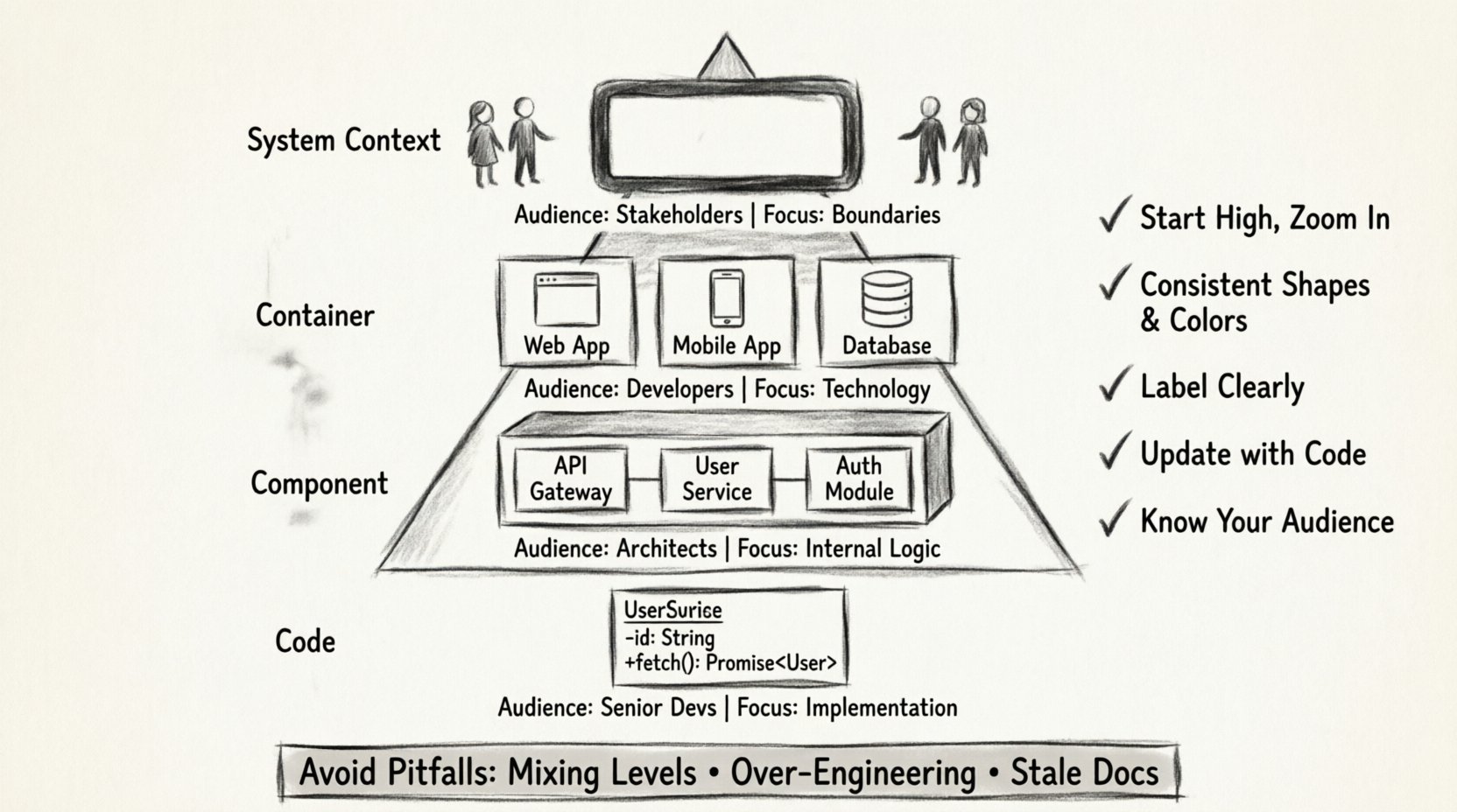
The C4 Model addresses this by defining four distinct levels of abstraction. Each level answers a specific set of questions. This hierarchy ensures that you provide the right amount of detail for the right audience.
- Level 1: System Context Diagram. What is the system and who uses it?
- Level 2: Container Diagram. What is the system made of?
- Level 3: Component Diagram. How does the system work internally?
- Level 4: Code Diagram. How do specific parts function?
By separating these concerns, you prevent the cognitive overload that often accompanies architectural documentation. You can focus on the business value at the top level and drill down into technical implementation details only when necessary.
📊 The Four Levels of Abstraction
To understand the framework, one must understand the specific purpose of each diagram type. Below is a comparison of the levels, outlining their scope and audience.
| Level | Name | Focus | Typical Audience |
|---|---|---|---|
| 1 | System Context | High-level boundaries | Stakeholders, Management |
| 2 | Container | Technology choices | Developers, DevOps |
| 3 | Component | Internal logic | Developers, Architects |
| 4 | Code | Specific classes | Senior Developers |
Each level builds upon the previous one. You do not create a Component diagram without first establishing the Container diagram. This ensures a logical flow of information.
🌍 Level 1: System Context Diagram
The System Context diagram is the starting point. It provides the bird’s-eye view of the software system. The goal here is to define the boundaries of the system in question.
Key Elements
- The System: Represented as a large box in the center. This is the application or service you are documenting.
- Users: These are people interacting with the system. They can be human users or external systems acting on their behalf.
- Relationships: Lines connecting users to the system indicate interaction.
Best Practices
When drawing a System Context diagram, keep it simple. Do not list every single dependency. Focus on the primary external actors. If a system relies on a third-party payment gateway, show that. If it relies on an internal database, that is usually considered part of the system or infrastructure and might not need explicit detailing at this level.
Avoid technical jargon. Use names that business stakeholders understand. Instead of “Microservice A,” use “Order Processing Service.” This makes the diagram accessible to product managers and sales teams who need to understand the scope of the project.
📦 Level 2: Container Diagram
Once the boundaries are set, the next step is to break the system down into its major building blocks. These blocks are called containers.
What is a Container?
A container is a distinct runtime environment. It is a unit of deployment. Examples include web applications, mobile applications, microservices, databases, and data lakes. This level answers the question: “How is the system built?”
Designing for Clarity
- Grouping: Group related containers together. For instance, all backend services might be grouped, while frontend applications are separate.
- Technology Tags: Indicate the technology stack used. A container might be labeled as a “Node.js API” or a “PostgreSQL Database.” This helps developers understand the ecosystem quickly.
- Connections: Show how containers communicate. Use arrows to indicate data flow. Label these connections with the protocol used, such as HTTP, gRPC, or TCP.
This level is crucial for understanding the deployment topology. It helps DevOps teams understand where services need to run and how they should be secured.
⚙️ Level 3: Component Diagram
Inside a container, there is often complexity. The Container diagram tells us what the pieces are, but the Component diagram tells us how they function together.
Defining Components
A component is a distinct unit of functionality within a container. Think of a component as a module or a package. It is not a single file or class, but a logical grouping of code that performs a specific responsibility.
For example, in a web application container, you might have components for “Authentication,” “User Management,” and “Reporting.” These components interact with each other to deliver the full feature set of the container.
Visual Hierarchy
- Responsibility: Each component should have a single responsibility. If a component does too much, the diagram becomes cluttered.
- Interfaces: Clearly define how components talk to each other. Use simple lines to show interaction.
- Abstraction: Do not show every single class. Focus on the high-level logic. This keeps the diagram readable and maintainable.
This level is the most common point of confusion. It is tempting to show too much detail. Remember, the goal is to explain the architecture, not to generate code documentation automatically. If the diagram becomes harder to read than the code itself, you have added too much detail.
💻 Level 4: Code Diagram
The Code level is rarely needed for general architectural documentation. It is reserved for specific cases where understanding the internal logic of a single component is critical.
When to Use It
Use this level when explaining a complex algorithm, a specific design pattern, or a critical piece of logic that impacts the entire system. It is the deepest level of detail.
Limitations
- Maintenance: Code changes frequently. Diagrams of code classes can become outdated within hours of a commit.
- Tooling: Generating these diagrams automatically is often the only viable option, as manual maintenance is too burdensome.
- Accessibility: Most stakeholders will not need to see this level. Use it sparingly.
For most teams, stopping at the Component level is sufficient. The C4 Model is flexible, and you do not need to use all four levels for every system.
🎨 Principles of Readability
Creating a diagram that follows the C4 structure is only half the battle. The other half is ensuring it is readable. A complex diagram that follows the rules is still useless if no one can understand it.
Consistency is Key
Consistency reduces cognitive load. If you use a specific shape for a user, use that shape everywhere. If you use a specific color for external systems, maintain that color scheme across all diagrams.
- Shapes: Use standard shapes. Rectangles for systems, cylinders for databases, stick figures for users.
- Colors: Use color to convey meaning. For example, use red for critical paths or deprecated features. Use green for healthy services.
- Fonts: Keep font sizes uniform. Headings should be larger than body text. Do not mix fonts.
Labeling and Naming
Labels should be concise and descriptive. Avoid vague terms like “Thing” or “Data.” Instead, use “User Profile Data” or “Order History.” If a label is too long, consider shortening it or using a legend.
Naming conventions are vital. Ensure that the names of components match the names used in the codebase. This reduces friction when developers try to map the diagram to the actual implementation.
Visual Hierarchy
Use size and position to indicate importance. The main system should be central and large. Peripheral systems should be smaller and on the edges. This guides the viewer’s eye to the most important elements first.
🚫 Common Pitfalls
Even experienced architects make mistakes. Being aware of common pitfalls helps you avoid them.
- Mixing Levels: Do not put Component details inside a Container diagram. Keep the levels distinct. If you need to show internal logic, create a new diagram.
- Over-Engineering: Do not try to diagram every single relationship. Focus on the critical paths. If a relationship is trivial, omit it.
- Ignoring Audience: Do not create a technical diagram for a business meeting. Do not create a business diagram for a code review. Tailor the diagram to the reader.
- Stale Documentation: The biggest risk to a diagram is that it no longer matches the code. If the diagram is not updated regularly, it becomes a liability.
🔄 Maintenance and Evolution
Documentation is not a one-time task. It is an ongoing process. As the software evolves, the architecture changes. Your diagrams must change with it.
Integration with Development
Integrate diagram updates into your workflow. Treat the diagrams as code. Store them in version control alongside your source code. This ensures that every change is tracked and reviewed.
Automation
Where possible, automate the generation of diagrams. Many tools allow you to generate diagrams from code annotations or configuration files. This reduces the burden on the team and ensures accuracy.
Review Cycles
Include diagram review in your sprint planning or architecture review meetings. Ask the team to verify the diagrams during design discussions. If a diagram is outdated, flag it immediately.
🤝 Collaboration and Feedback
Architecture is a team effort. Diagrams should not be created in a vacuum. They should be a tool for collaboration.
- Peer Review: Have other team members review the diagrams. They might spot inconsistencies or missing connections that you missed.
- Feedback Loops: Encourage feedback. If a diagram is confusing, ask why. Use the feedback to improve the visual design.
- Knowledge Sharing: Use diagrams during onboarding. They are an excellent tool for bringing new team members up to speed quickly.
🔍 Summary of Best Practices
To summarize the key takeaways for crafting readable diagrams:
- Start High: Begin with the System Context and only drill down when necessary.
- Keep it Simple: Avoid clutter. Use whitespace effectively.
- Use Standards: Follow the C4 conventions for shapes and labels.
- Update Regularly: Treat documentation as code.
- Know Your Audience: Tailor the detail to the reader’s needs.
- Focus on Value: Only document what adds value to the understanding of the system.
By adhering to these principles, you create a documentation set that is not just a record of the past, but a tool for the future. It becomes a source of truth that helps the team make better decisions and communicate more effectively.
🛠️ Final Thoughts on Implementation
Implementing the C4 Model requires a shift in mindset. It is not about drawing pretty pictures; it is about structuring thought. When you sit down to draw a diagram, you are forced to clarify your understanding of the system. If you cannot draw it, you likely do not understand it well enough.
This process of clarification is valuable. It reveals gaps in knowledge, potential risks, and areas for improvement. The diagram is a byproduct of this thinking process.
Remember that the goal is communication. If the diagram helps a developer understand the system faster, or helps a stakeholder understand the business logic, then the effort was worth it. Prioritize clarity over complexity. Prioritize accuracy over completeness.
As you move forward with your architecture documentation, keep these guidelines in mind. The C4 Model is a powerful tool, but it requires discipline to use correctly. With practice, your diagrams will become a vital asset to your team, reducing confusion and speeding up development cycles.

