


In the intricate architecture of software design, clarity is currency. When developers, architects, and stakeholders discuss system behavior, they often turn to visual representations to bridge the gap between abstract logic and concrete implementation. Among the various diagrams available, the sequence diagram stands out as a dynamic tool for illustrating how components interact over time. However, within this diagrammatic landscape, one element serves as the foundational backbone: the lifeline.
A lifeline is not merely a vertical line; it is a representation of an individual participant in a system, persisting through the duration of the interaction. Understanding lifelines deeply allows teams to model complex behaviors, identify bottlenecks, and validate architectural decisions before a single line of code is written. This guide explores the anatomy, usage, and best practices surrounding lifelines in sequence diagrams, providing a comprehensive look at how they function as the heart of interaction modeling.
🔍 What Is a Lifeline?
At its core, a lifeline represents an instance of a class, an object, a user, or an external system within a specific context. It signifies existence. Just as a biological lifeline indicates the duration of life, a UML lifeline indicates the duration of an object’s participation in a sequence of events. Without lifelines, a sequence diagram is merely a collection of arrows with no anchor to the entities performing the actions.
When designing a system, identifying the correct participants is the first step. Each participant gets its own lifeline. These lifelines are arranged horizontally across the top of the diagram, establishing the spatial relationship between components. The vertical axis represents time, flowing from top to bottom. This temporal progression is crucial for understanding causality and order of operations.
Key characteristics of a lifeline include:
- Identity: It uniquely identifies a participant, often labeled with an instance name (e.g.,
userSession1) or a class name (e.g.,Database). - Duration: It exists from the start of the interaction until the end, or until the object is destroyed.
- Focus: It can be in a state of activity (activation) or idle, visualized through specific graphical notations.
- Connectivity: It serves as the source and destination for all interaction messages.
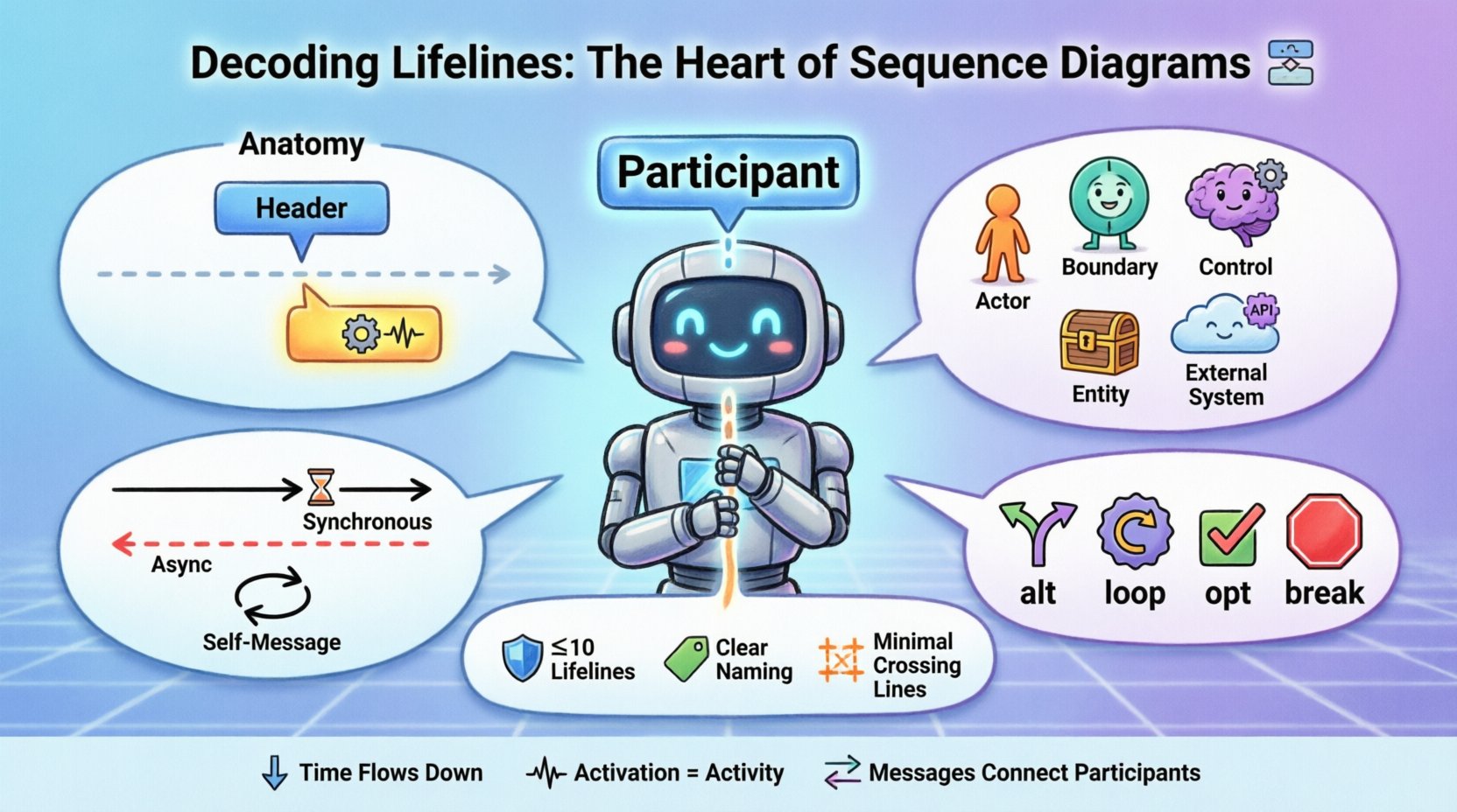
🏗️ Anatomy of a Lifeline
Visual clarity is paramount in technical documentation. The graphical representation of a lifeline follows standard conventions to ensure universal understanding among technical teams. Understanding these components helps in reading and creating diagrams that are self-explanatory.
1. The Lifeline Rectangle
Every lifeline begins with a rectangle at the top of the diagram. This box contains the name of the participant. If the diagram is focused on specific instances, the name might be italicized to denote an instance. If it represents a class level, it remains plain text. This distinction matters for scope and scope of influence.
2. The Dashed Line
Extending downwards from the rectangle is a dashed vertical line. This line represents the passage of time for that specific object. It is the timeline upon which events occur. The line implies that the object exists throughout the scenario being modeled, even if it is not actively processing messages at every moment.
3. The Activation Bar
Perhaps the most critical element superimposed on the lifeline is the activation bar (also known as the focus of control). This is a thin, rectangular box drawn directly on the dashed line. It indicates the period during which the object is performing an action or is active. When a message is received and the object begins processing, the activation bar appears. It ends when the processing is complete or the control is passed to another object.
Understanding the activation bar helps in identifying:
- Blocking Calls: If the activation bar is long, the object is busy for an extended period.
- Concurrency: Multiple activation bars can overlap, suggesting parallel processing or asynchronous handling.
- Responsiveness: Short activation bars suggest lightweight operations, while long ones may indicate heavy computation or network latency.
📊 Types of Participants and Lifelines
Not all lifelines are created equal. In a complex system, different types of lifelines serve different purposes. Categorizing them helps in organizing the diagram and ensuring that the flow of control makes logical sense. The following table outlines common lifeline types and their specific roles.
| Type | Description | Visual Indicator | Common Use Case |
|---|---|---|---|
| Actor | Represents a human user or an external system initiating the interaction. | Stick figure or labeled box | User login, API request |
| Boundary Object | Represents the interface between the system and the outside world. | Labeled rectangle | UI Controller, API Gateway |
| Control Object | Handles the logic and flow of the interaction. | Labeled rectangle | Service Manager, Orchestrator |
| Entity Object | Represents data or persistent storage. | Labeled rectangle | Database, File System |
| External System | Represents third-party services or legacy systems. | Labeled rectangle (often dashed) | Payment Gateway, Auth Provider |
📡 Message Flow and Lifeline Interaction
The primary function of a lifeline is to facilitate message flow. Arrows connect lifelines to show how information moves between participants. The direction and style of these arrows define the nature of the interaction. Properly labeling these messages is as important as drawing the lifelines themselves.
Message Types
Different types of messages convey different expectations regarding the receiver. Below is a breakdown of common message types and how they relate to the lifeline’s behavior.
- Synchronous Call: The sender waits for the receiver to finish the operation. The activation bar of the receiver starts immediately, and the sender’s activation bar pauses until the return message is received.
- Asynchronous Call: The sender sends a message and continues without waiting. The arrow is typically an open arrowhead. The receiver’s activation bar starts independently of the sender’s flow.
- Return Message: Indicates the completion of a task. It usually flows back up the lifeline. The arrow is often a dashed line.
- Self-Message: An object calling a method on itself. The arrow loops back to the same lifeline.
- Create/Delete: Special messages indicating the birth or destruction of an object lifeline.
Timing and Sequence
Time flows vertically. A message sent from Lifeline A to Lifeline B must originate from the top of the arrow at a point higher than where the arrowhead lands on Lifeline B. This vertical positioning enforces the causal order. If two messages originate from the same lifeline, their order matters. If Lifeline A sends Message 1 and then Message 2, Message 2 must be drawn below Message 1.
This temporal logic is essential for debugging race conditions. If two messages are drawn at the same vertical level but on different lifelines, it implies they happen concurrently or the order is undefined.
🔄 Managing Complexity: Combined Fragments
Real-world interactions are rarely linear. Systems often branch, loop, or conditionally execute. To represent this within the constraints of a sequence diagram, combined fragments are used. These fragments affect how lifelines behave during specific scenarios.
1. Alternative (alt)
This fragment represents a choice. For example, if a user enters a correct password, one path is taken; if incorrect, another is taken. The lifeline for the authentication service will have different activation bars depending on the condition. The diagram must clearly label the condition for each path to avoid ambiguity.
2. Loop
When an interaction repeats, such as processing a list of items, a loop fragment is used. The lifeline of the processing service will show multiple activation bars or a single extended bar with a loop condition. This visualizes the volume of work without cluttering the diagram with repetitive lines.
3. Optional (opt)
Similar to alternatives, but representing a single optional path. If a condition is met, the interaction occurs; if not, it is skipped. The lifeline remains present, but the activation bar may not appear if the optional step is bypassed.
4. Break
This indicates that the current flow is terminated early. The lifelines involved may show an abrupt end to their activation bars, signifying an exception or early exit condition.
Using these fragments correctly prevents the lifeline from becoming a tangled web of lines. It groups related logic, making the diagram easier to parse.
⚖️ Best Practices for Lifeline Design
To maintain high-quality documentation, adhering to a set of design principles is necessary. A diagram that is too complex defeats its purpose. A diagram that is too simple fails to convey necessary details. Balancing these factors requires discipline.
1. Limit the Number of Lifelines
One of the most common errors is including too many participants. A sequence diagram should focus on a specific scenario. If you have more than ten lifelines, the diagram is likely trying to do too much. Split the scenario into smaller, focused diagrams. Group related lifelines together to minimize crossing lines.
2. Consistent Naming Conventions
Name lifelines clearly. Avoid generic names like Object1 or Service. Use domain-specific names like OrderProcessor or InventoryManager. If the same class is involved in multiple scenarios, consider using the same instance name to maintain continuity, or distinct names if they represent different states.
3. Manage Activation Bars
Do not draw activation bars for every single message if the processing time is negligible. This creates visual noise. Only show activations where the duration is significant or where the control flow changes state. If an object receives a message and immediately passes it along, the activation bar might be very short or omitted depending on the level of abstraction.
4. Minimize Crossing Lines
Arrange lifelines horizontally to reduce the number of crossing message arrows. Crossing lines make the diagram difficult to follow. If you must cross lines, use orthogonality (right angles) for the message paths to improve readability.
5. Handle Asynchrony Carefully
When dealing with asynchronous messages, ensure the visual distinction is clear. Use different arrow styles. Do not imply a return message unless one exists. If the system is fire-and-forget, do not draw a return arrow, as it misrepresents the flow.
🚧 Common Pitfalls and How to Avoid Them
Even experienced modelers make mistakes. Recognizing common pitfalls early can save hours of refactoring. Below are frequent issues encountered when working with lifelines.
- Missing Return Messages: Forgetting to draw the return path for synchronous calls can make the diagram look incomplete. While sometimes optional in high-level views, for detailed design, they clarify the flow.
- Confusing Object with Class: Mixing instance names (italicized) with class names (plain) can confuse readers about whether they are looking at a specific case or a general template.
- Vertical Alignment Errors: Drawing a message arrowhead below the source of the previous message implies a delay or a future event that hasn’t happened yet in the sequence. Keep arrows aligned with the activation points.
- Overlapping Activations: While concurrency is real, overlapping activation bars without a clear indication of threads or async handling can confuse the reader about whether the system is blocking.
- Ignoring Destruction: If an object is destroyed during the interaction, a ‘cross’ symbol should be drawn at the end of the lifeline. Ignoring this implies the object persists indefinitely, which might be incorrect for resource management scenarios.
🔎 Advanced Scenarios: Recursive and Nested Calls
In complex systems, objects often call themselves or invoke deeply nested sub-processes. This is where lifelines become particularly interesting.
Recursive Calls
A recursive call occurs when a method calls itself. In the diagram, this appears as an arrow looping from the lifeline back to itself. It is often used to represent traversal algorithms or iterative processing. The activation bar will show a distinct segment for the recursion.
Nested Calls
When Object A calls Object B, and Object B calls Object C, the lifelines stack. Object C’s activation bar will appear within Object B’s activation bar, and Object B’s will appear within Object A’s. This nesting visualizes the call stack depth. It is critical for understanding memory usage and stack overflow risks in the design phase.
🛠️ Tooling Agnostic Approach
While many software tools exist to create these diagrams, the principles of the lifeline remain consistent regardless of the platform. Whether using a whiteboard, a vector graphics editor, or specialized modeling software, the rules of the UML standard apply. Focus on the semantics of the interaction rather than the aesthetic of the tool.
When selecting a tool, consider:
- Collaboration: Can multiple people edit the diagram simultaneously?
- Version Control: Is the diagram stored as a file that can be tracked?
- Export: Can it be exported to PDF or image formats for documentation?
- Standard Compliance: Does it support standard UML shapes for lifelines and messages?
🧩 Integrating Lifelines with System Architecture
Lifelines are not isolated elements. They reflect the underlying system architecture. If a lifeline represents a microservice, the message flow between lifelines often corresponds to network requests. If it represents a database, it corresponds to queries. Mapping the diagram to the actual deployment topology helps in identifying performance bottlenecks.
For instance, if a single lifeline receives messages from five different sources and takes a long time to process each one, it might indicate a need for horizontal scaling. The sequence diagram, therefore, becomes a tool for capacity planning. By analyzing the activation durations and message frequencies, architects can estimate resource requirements.
📝 Summary of Key Takeaways
Mastering the sequence diagram requires a deep understanding of the lifeline. It is the anchor that holds the narrative of the system together. Key points to remember include:
- Lifelines represent participants over a period of time.
- Activation bars indicate activity and focus of control.
- Vertical flow represents time and causality.
- Message types define interaction nature (sync, async, return).
- Fragments manage complexity (loops, alternatives, breaks).
- Cleanliness matters (limit lifelines, reduce crossing lines).
- Consistency ensures clarity (naming, styling).
By treating lifelines with the respect they deserve, teams can create diagrams that are not just documentation, but active tools for design and communication. These diagrams serve as a shared language, reducing ambiguity and aligning expectations across the development lifecycle.
🚀 Moving Forward
As systems grow in complexity, the need for precise interaction modeling increases. Lifelines provide the structure needed to navigate this complexity. Start with simple scenarios, ensure the lifelines are accurate, and gradually add depth with fragments and advanced message types. Regular reviews of these diagrams against the actual code ensure they remain relevant.
Remember, the goal is not just to draw lines, but to understand the flow. When you can trace a request from the user’s click to the database write and back again solely by looking at the lifelines and arrows, you have achieved clarity. This clarity is the foundation of robust software engineering.
