


In modern distributed systems, the complexity of communication between independent services often outpaces the clarity of the documentation surrounding them. As teams move away from monolithic structures toward microservices, the need to visualize interaction flows becomes critical. Sequence diagrams serve as a fundamental tool in this transition, offering a time-ordered view of how services talk to one another. This guide explores the mechanics, patterns, and best practices for designing these diagrams within a microservices context.
🧠 Understanding the Core Concept
A sequence diagram is a type of interaction diagram that shows how processes operate with one another and in what order. In the context of microservices, it is not merely a static picture of the system; it is a narrative of data flow and control logic over time. Unlike a class diagram that shows structure, a sequence diagram shows behavior.
- Time Axis: The vertical axis represents time, moving from top to bottom.
- Interaction Axis: The horizontal axis represents different participants, such as clients, gateways, or backend services.
- Messages: Arrows indicate the transfer of information or commands between participants.
When architects map out a request for a feature, such as “Place Order,” they must trace the path from the user interface through the API gateway, across multiple services like Inventory, Billing, and Shipping, and finally to the database layer. A sequence diagram captures this journey explicitly.
🏗️ Key Components of a Microservice Sequence Diagram
To construct an accurate representation of system interactions, one must understand the standard elements used in UML (Unified Modeling Language) adapted for distributed systems. Each element carries specific semantic meaning regarding the lifecycle and state of the interaction.
1. Participants (Lifelines)
Participants are the objects, actors, or services involved in the interaction. In a microservices environment, these are typically:
- External Actors: Human users or third-party systems initiating the request.
- API Gateway: The entry point that handles routing, authentication, and rate limiting.
- Domain Services: The core business logic units (e.g., OrderService, UserService).
- Data Stores: Databases, caches, or message queues associated with a service.
2. Activation Bars
Also known as focus of control, these vertical rectangles appear on a lifeline. They indicate the period during which an object is performing an action. A long activation bar suggests a heavy processing load or a blocking operation, while a short one implies a quick pass-through. In distributed systems, activation bars help identify where latency accumulates.
3. Messages
Messages represent the communication between lifelines. They are the most critical part of the diagram. They are categorized into:
- Synchronous: The sender waits for a response before continuing. Common in REST API calls.
- Asynchronous: The sender does not wait. Common in event-driven architectures using message brokers.
- Return Messages: Often shown as dashed lines, indicating the response from the called service.
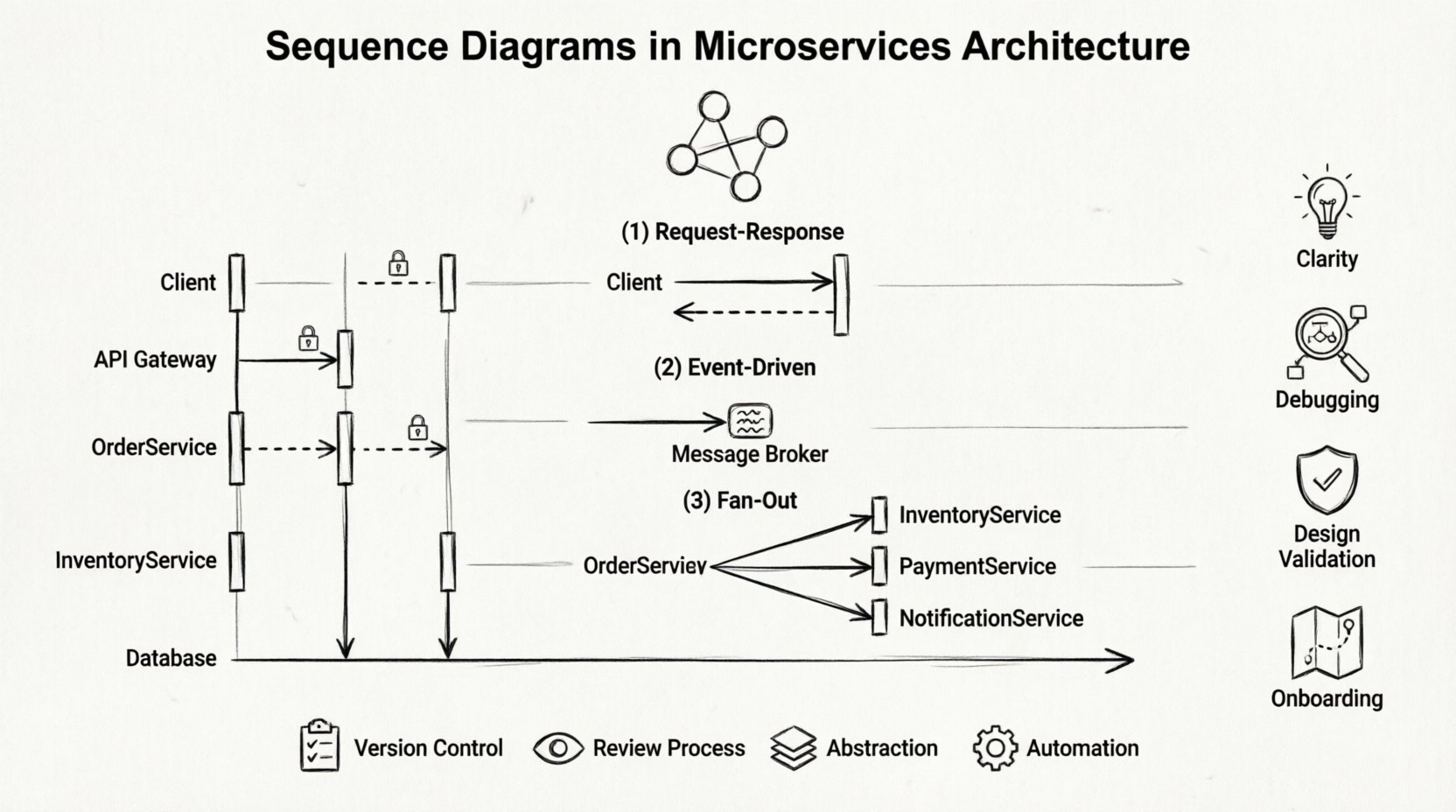
📉 Why Use Diagrams for Microservices?
Microservices introduce latency, network failures, and eventual consistency challenges. Visualizing these interactions helps teams anticipate issues before code is written. Below is a breakdown of the specific advantages this modeling technique brings to distributed architecture.
| Benefit | Description |
|---|---|
| Clarity | Reduces ambiguity about which service handles specific logic. |
| Debugging | Helps trace request IDs through multiple hops during incident resolution. |
| Design Validation | Allows teams to spot circular dependencies or tight coupling early. |
| Onboarding | Provides new engineers with a map of the system’s communication flow. |
🔄 Common Interaction Patterns
Different architectural requirements dictate different interaction styles. A sequence diagram allows you to model these patterns distinctively. Understanding these patterns ensures that the diagram reflects the actual runtime behavior.
1. Request-Response (Synchronous)
This is the most common pattern for web APIs. A client sends a request and waits for a response. The sequence diagram shows a solid arrow from Client to Service A, and a dashed arrow returning from Service A to Client.
- Use Case: Fetching user profile data.
- Consideration: If Service A calls Service B, the total response time is the sum of both latencies.
2. Event-Driven (Asynchronous)
In this model, a service publishes an event to a message broker without waiting for a consumer. The diagram shows a message arrow without a return line, or a return line with a delay.
- Use Case: Sending a confirmation email after an order is placed.
- Consideration: Ensures the system remains responsive even if downstream processing is slow.
3. Fan-Out and Aggregation
Often, a single request requires data from multiple sources. A gateway or aggregator service calls several downstream services in parallel and combines the results.
- Use Case: A dashboard view pulling data from Analytics, User, and Notification services.
- Consideration: The diagram must show parallel activation bars to indicate concurrent execution.
🛠️ Constructing the Diagram: A Step-by-Step Approach
Creating a diagram requires a systematic approach to ensure accuracy. The process involves identifying the scope, defining the actors, and mapping the message flow.
Step 1: Define the Scope
Start with a single use case. Do not attempt to diagram the entire system at once. Select a specific flow, such as “User Login” or “Process Payment.” This keeps the diagram readable and focused.
Step 2: Identify Participants
List all services involved. Ensure you include external dependencies like third-party payment gateways or email providers. Omitting a participant leads to an incomplete model.
Step 3: Map the Flow
Draw the primary success path first. Use solid arrows for synchronous calls and dashed arrows for asynchronous events. Add return messages for every request that expects data back.
Step 4: Add Error Handling
Production systems rarely run without errors. Include paths for timeouts, service unavailability, and invalid data. Use the alt or opt fragments to show alternative paths.
- Timeout: Show the client giving up after a specific duration.
- Retry: Indicate if the client or gateway retries the request.
- Failover: Show switching to a secondary service if the primary fails.
📋 Advanced Elements and Notation
Standard arrows are not enough for complex microservices. Advanced notation helps convey timing constraints and logic branches.
Execution Occurrences
When a service calls itself recursively, or when a loop occurs (e.g., retrying a failed transaction), use the ref or loop fragment. This keeps the diagram clean while indicating repeated actions.
Timing Constraints
Microservices are sensitive to latency. You can annotate messages with time limits. For example, “Service A must respond within 200ms.” This highlights performance requirements directly on the design.
Combined Fragments
Use alt (alternative) for if-else logic, opt (optional) for conditions that might not happen, and break for exceptions. These frames allow you to model decision points without cluttering the main flow.
⚠️ Common Pitfalls to Avoid
Even experienced architects make mistakes when modeling distributed systems. Being aware of these common errors can save significant time during development and maintenance.
| Pitfall | Consequence | Mitigation |
|---|---|---|
| Ignoring Latency | Developers assume instant communication. | Annotate expected network delays. |
| Over-Coupling | Services become dependent on specific internal states. | Focus on public interfaces, not internal implementation. |
| Missing Error Paths | System crashes in production due to unhandled exceptions. | Always diagram the “Happy Path” and the “Exception Path”. |
| Too Much Detail | Diagram becomes unreadable and hard to maintain. | Abstract database calls into a generic storage symbol. |
🔍 Best Practices for Maintenance
A diagram is only useful if it remains accurate. As the system evolves, the diagram must evolve with it. Treat diagrams as living documentation rather than one-time artifacts.
- Version Control: Store diagrams in the same repository as the code. This ensures changes to the API trigger updates to the diagram.
- Review Process: Include diagrams in pull request reviews. If the code changes the flow, the diagram must change.
- Abstraction Levels: Maintain different levels of detail. A high-level diagram for stakeholders, and a detailed diagram for developers.
- Automation: Where possible, generate diagrams from API specifications (like OpenAPI/Swagger). This reduces the manual effort required to keep them up to date.
🌐 Integrating with Documentation
Sequence diagrams should not exist in isolation. They are part of a larger documentation ecosystem. Linking these diagrams to API reference documentation and runbooks creates a cohesive knowledge base.
When documenting an API endpoint, include a sequence diagram showing how that endpoint interacts with internal services. This provides context that a simple endpoint description cannot offer. It answers the question: “What happens after this request leaves the gateway?”
🛡️ Security Considerations in Diagrams
Security is often an afterthought in design. However, sequence diagrams can highlight security boundaries. Indicate where authentication tokens are exchanged, where data is encrypted, and where authorization checks occur.
- Token Exchange: Show the flow of OAuth tokens or JWTs between services.
- Encryption: Mark messages traveling over public networks as encrypted (HTTPS/TLS).
- Access Control: Note where the API gateway validates permissions before passing the request.
📝 Summary of Key Takeaways
Designing sequence diagrams for microservices requires a balance between technical accuracy and readability. By focusing on the flow of control and data, teams can identify bottlenecks and design failures early. The process of creating these diagrams forces engineers to think through edge cases, error handling, and performance constraints before writing a single line of production code.
While the tools used to create them may vary, the underlying principles remain constant. A clear diagram reduces cognitive load, improves collaboration, and ensures that the distributed nature of the system is understood by all stakeholders. Whether using text-based definition languages or graphical modeling tools, the goal is the same: to make the invisible visible.
Adopting this practice consistently across projects leads to more robust architectures. It shifts the conversation from “how does this code work?” to “how does this system behave?”. This shift is essential for maintaining complex, scalable microservices environments over the long term.

