


In the complex ecosystem of software development, misalignment is the most expensive currency. Teams often struggle when technical specifications are buried in dense text documents, leading to gaps between design and implementation. This is where sequence diagrams prove their worth. They are not merely technical artifacts for engineers; they are potent communication tools that bridge the gap between architecture, development, and product management.
Visualizing system interactions allows stakeholders to grasp the flow of data and control without getting lost in the syntax of code. This guide explores how to leverage sequence diagrams to foster clarity, reduce friction, and ensure that every team member is working from the same blueprint. We will move beyond basic syntax to understand the strategic value of these diagrams in collaborative environments.
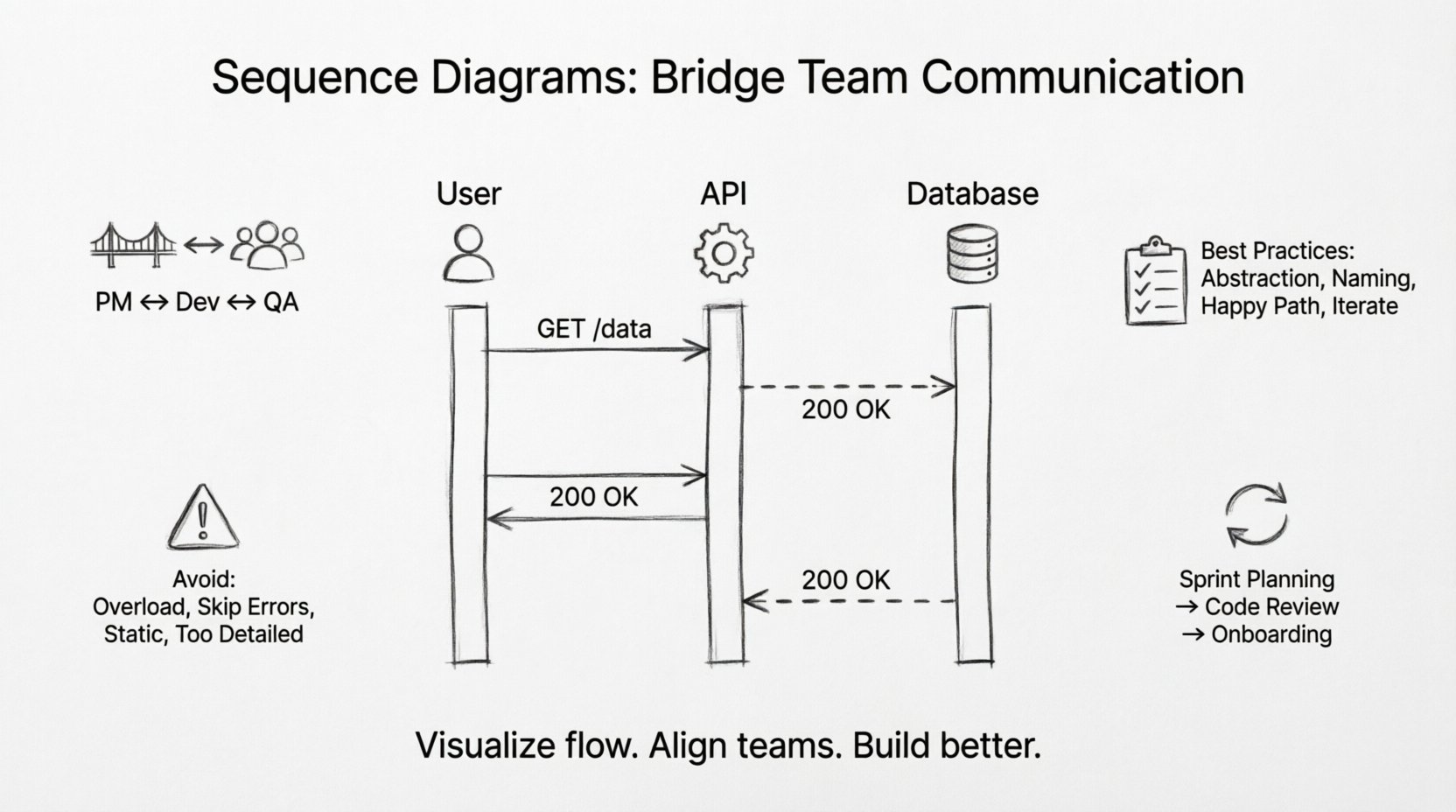
🧩 The Foundation: What Is a Sequence Diagram?
A sequence diagram is a type of interaction diagram that shows how objects or processes interact with one another over time. It focuses on the time ordering of messages exchanged between participants. While other diagrams like class diagrams show structure, sequence diagrams show behavior and interaction.
For a team, this distinction is vital. It shifts the conversation from “what does this look like?” to “how does this work?”. By mapping out the sequence of events, teams can identify logical gaps before writing a single line of code.
Key Components for Understanding
- Lifelines: Represent the participants in the interaction, such as users, systems, or databases. These are the vertical lines that anchor the diagram.
- Messages: Represented by arrows, these indicate the flow of data or control from one participant to another.
- Activation Bars: Rectangles on a lifeline showing when an object is actively performing a task.
- Return Messages: Dashed arrows indicating a response or data return to the caller.
When teams discuss a feature, pointing to a sequence diagram provides a shared reference point. It eliminates the ambiguity of phrases like “eventually” or “later.” In a diagram, time flows downwards. If a message happens before another, it is visually higher on the page. This temporal clarity is invaluable for debugging and planning.
🤝 Bridging the Gap Between Roles
One of the primary challenges in software development is the divergence of mental models. A product manager visualizes a user journey, a developer visualizes a database transaction, and a QA engineer visualizes a test case. Sequence diagrams serve as a universal translator among these perspectives.
1. Product Managers & Designers
For non-technical stakeholders, a sequence diagram offers a high-level view of the user journey. It clarifies what happens behind the scenes when a button is clicked. Instead of abstract requirements, they see:
- Which systems must respond.
- Where the data originates.
- What the expected user feedback looks like.
This visibility helps manage expectations regarding latency and error handling. If a diagram shows a database query taking multiple steps, stakeholders understand why the UI might pause.
2. Developers & Architects
For technical teams, these diagrams are the blueprint for implementation. They define the contract between services. When working in microservices architectures, a sequence diagram is often the first artifact created during API design. It dictates:
- The order of API calls.
- The required headers and payloads.
- The error paths that must be handled.
By agreeing on the diagram first, developers avoid the costly process of refactoring code to match a different interaction flow later.
3. QA Engineers
Testers rely on sequence diagrams to derive test cases. The diagram explicitly shows the happy path and the alternative paths (often marked with “alt” or “opt” frames). This ensures comprehensive coverage. If a diagram shows a failure path where a service returns an error code, the QA team knows to write a test case for that specific error condition.
📊 Visualizing Complexity Through Structure
As systems grow, interactions become convoluted. Textual descriptions often fail to capture the nuance of concurrent processes or conditional logic. Sequence diagrams handle this through specific structural elements that enhance communication.
Combined Fragments
These are boxes that group a set of interactions with specific behavior. They are essential for explaining logic without cluttering the main flow.
- Alt (Alternative): Shows branching logic (e.g., if user is logged in vs. not logged in).
- Opt (Optional): Indicates a section that may or may not occur.
- Loop: Represents repeated actions, such as iterating through a list of items.
- Break: Indicates a condition where the process stops early.
Using these elements allows a team to discuss complex logic in a structured way. Instead of describing a nested if-statement in a meeting, a team can point to a “Loop” frame and say, “This is where the batch processing happens.”
Asynchronous vs. Synchronous
The direction and style of arrows communicate timing. A solid arrow typically implies a synchronous call (the caller waits for a response). A hollow arrow often implies an asynchronous message (fire and forget). Clarifying this distinction prevents bottlenecks in system design. If a frontend waits for a backend to process a heavy task, the UI freezes. The diagram highlights this risk immediately.
🛠️ Best Practices for Collaborative Diagramming
Creating a sequence diagram is easy; creating one that communicates effectively is a skill. To ensure these diagrams serve their purpose as communication tools, teams should adhere to specific standards.
1. Abstraction Levels
Not every diagram needs to show every API parameter. A diagram meant for architectural review should focus on system-to-system interactions. A diagram meant for code review might need more detail. Mixing these levels causes confusion. Decide the audience before drawing.
2. Naming Conventions
Use consistent names for participants. If you call a service “AuthService” in the diagram, the code should reflect that. Inconsistent naming creates a disconnect between the design and the implementation, forcing the reader to translate terms mentally.
3. Focus on the Happy Path First
Start by mapping the successful flow. Once the team agrees on the primary path, add the error handling and edge cases. Trying to map everything at once often leads to a tangled diagram that no one can read.
4. Iterate and Refine
A sequence diagram is a living document. As the project evolves, the diagram should be updated. If a new service is introduced, the diagram must change. Treating it as a static artifact that sits in a wiki and never changes renders it useless.
⚠️ Common Pitfalls to Avoid
Even with good intentions, teams can misuse sequence diagrams. Recognizing these pitfalls helps maintain clarity.
| Pitfall | Impact | Mitigation |
|---|---|---|
| Overloading the Diagram | Too many participants make the diagram unreadable. | Split into multiple diagrams focused on specific features. |
| Ignoring Error Flows | Developers assume success and skip error handling. | Explicitly draw dashed return lines for errors. |
| Static References | Diagram does not match current system state. | Link diagrams to code repositories for version control. |
| Too Much Detail | Stakeholders get lost in variable names. | Keep labels generic (e.g., “Request Data”) unless critical. |
🔄 Integrating Diagrams into the Workflow
To maximize the value of sequence diagrams, they must be integrated into the daily workflow, not treated as a one-time documentation task.
Pre-Sprint Planning
During sprint planning, create a draft sequence diagram for the upcoming feature. This acts as a technical spike. It reveals hidden dependencies. For example, you might realize that a feature requires data from a service you haven’t connected to yet. Identifying this before coding saves days of work.
Code Reviews
Include the diagram in pull request descriptions. Reviewers can compare the implemented code against the diagram. Did the code follow the message order? Did it handle the errors shown in the “alt” frame? This ensures the implementation matches the design intent.
Onboarding New Hires
When a new team member joins, a set of sequence diagrams is often more helpful than hours of verbal explanation. It provides a visual map of how the system functions. They can trace the flow of data from entry point to database and back.
📈 Comparing Diagrams to Text Specifications
Why choose a diagram over a text document? Both have their place, but for interaction flows, visuals win.
| Feature | Text Specification | Sequence Diagram |
|---|---|---|
| Time Sequence | Hard to visualize linearly. | Explicitly shown via vertical axis. |
| Concurrency | Requires complex descriptive language. | Parallel activation bars show overlap. |
| Review Speed | Requires reading paragraphs. | Scanning arrows takes seconds. |
| Clarity of Return | Often omitted or buried. | Return arrows are distinct visual elements. |
🎯 When to Use (and When Not To)
While powerful, sequence diagrams are not a solution for every problem. Knowing when to apply them is part of the communication strategy.
Use When:
- Designing APIs: To define request/response structures.
- Integrating Services: To understand how two different systems talk.
- Debugging Flows: To trace why a process failed at a specific step.
- Onboarding: To explain the system architecture to new members.
Avoid When:
- Simple CRUD: If a feature only involves creating, reading, updating, and deleting one entity, a diagram adds unnecessary overhead.
- State Changes: If the focus is on the state of an object rather than its interaction with others, a state diagram is better.
- High-Level Strategy: For business goals, a context diagram or system context diagram is more appropriate.
🧠 The Psychology of Visual Communication
Why do these diagrams work so well for communication? It comes down to cognitive load. The human brain processes visual information faster than text. When a developer reads a paragraph describing a network call, they must construct a mental model. When they see an arrow moving from A to B, the model is already built.
In a team setting, this reduces the friction of discussion. Instead of saying, “Well, I think the user sends the request, and then the server checks the token, and if it’s good, it talks to the DB,” a team member can point to the diagram. This shared visual context reduces the chance of misinterpretation. It transforms a debate into a verification process.
🔧 Maintaining Diagram Fidelity
One of the biggest risks is diagram rot. This occurs when the diagram becomes outdated because the code has changed. To prevent this:
- Version Control: Store diagrams alongside the code they describe. If the code moves, the diagram moves.
- Automated Checks: Some tools can generate diagrams from code. While manual editing is often preferred for clarity, having a generated version helps detect drift.
- Ownership: Assign ownership of specific diagrams to specific leads. If the “Payment Service” diagram changes, the Payment Lead must update it.
🚀 Conclusion
Sequence diagrams are more than just technical drawings; they are a language of collaboration. When teams adopt them as a primary communication tool, they reduce ambiguity, align expectations, and accelerate development. By focusing on the flow of interactions rather than just the static structure, teams can build systems that are robust, well-understood, and easier to maintain.
Start small. Pick a complex feature and map its interaction. Share it with the team. Refine it based on feedback. Over time, this practice becomes a natural part of how the team thinks and builds. The goal is not perfection in the drawing, but clarity in the understanding.

