


In the complex landscape of software development, clarity is currency. Systems are no longer simple scripts; they are intricate ecosystems of services, databases, and user interfaces communicating across networks. To navigate this complexity, engineers rely on visual models that capture behavior over time. Among these, the sequence diagram stands out as a critical tool for understanding how distinct parts of a system collaborate to achieve a specific goal. 🧩
A sequence diagram maps the interactions between objects or components in a chronological order. It answers fundamental questions: Who initiates the action? Who responds? What data is exchanged? And what happens if an error occurs? By visualizing these flows, teams can identify logic gaps, optimize performance, and align on architecture before writing a single line of code. This guide explores the mechanics, patterns, and strategic value of sequence diagrams in modern system design.
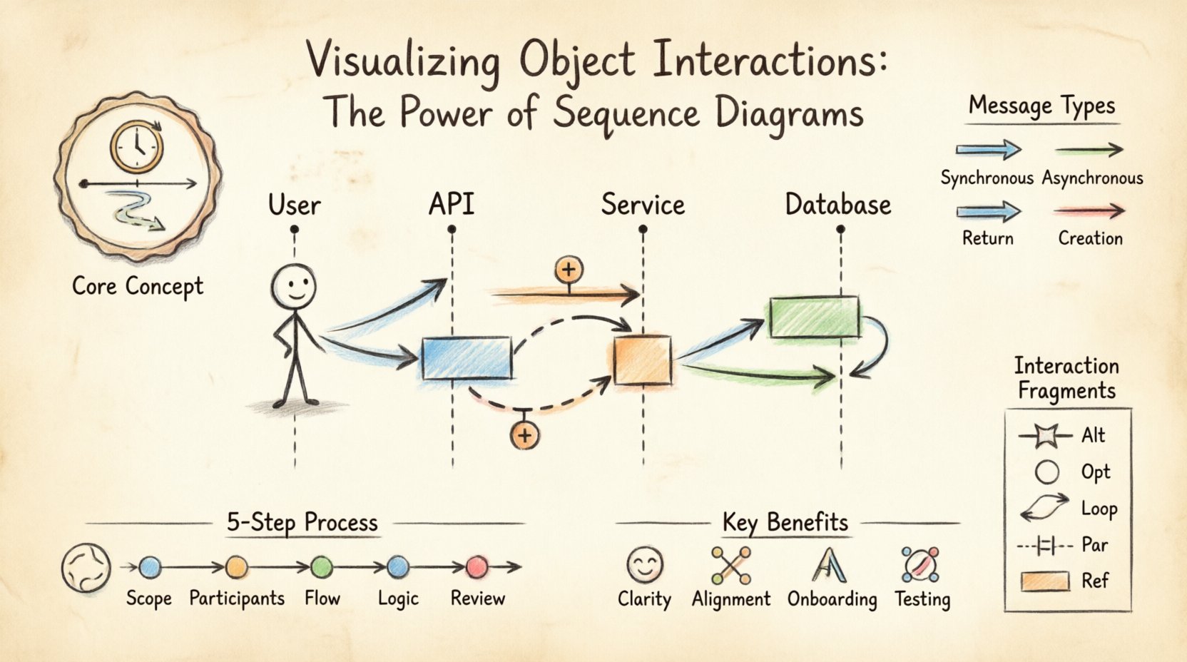
🔍 Understanding the Core Concept
At its heart, a sequence diagram is a snapshot of time. Unlike class diagrams, which show static structure, sequence diagrams depict dynamic behavior. They are a subset of the Unified Modeling Language (UML), designed to document the flow of messages between entities. These entities, often called participants, can be users, external systems, or internal classes.
The horizontal axis represents the participants, while the vertical axis represents time flowing downwards. This orientation allows developers to trace a thread of execution from start to finish. When a participant sends a message, a line extends from one lifeline to another. If the message requires a response, a return line travels back up. This visual feedback loop is essential for debugging logical errors that are often invisible in textual code alone.
🏗️ Anatomy of a Sequence Diagram
To create an effective diagram, one must understand its building blocks. Each element serves a specific purpose in conveying information about the system’s operation. Ignoring these nuances can lead to diagrams that are confusing rather than illuminating.
Key Components
- Lifelines: Vertical dashed lines representing the existence of an object or actor throughout the interaction. They act as the timeline for each participant.
- Actors: Stick figures representing external users or systems that initiate or receive interactions but are not part of the system itself.
- Messages: Arrows indicating communication between lifelines. These can be method calls, API requests, or data transfers.
- Activation Bars: Rectangular boxes on a lifeline showing when an object is actively processing a request. This indicates the period of execution.
- Return Messages: Dashed arrows indicating the response sent back to the caller.
Understanding these components allows for precise modeling. For instance, an activation bar helps visualize concurrency. If two bars overlap on the same lifeline, it suggests the object is handling multiple tasks simultaneously.
Message Types
Not all interactions are identical. The direction and style of the arrow convey critical information about the nature of the call.
| Message Type | Visual Representation | Behavior Description |
|---|---|---|
| Synchronous | Filled arrowhead | The caller waits for the receiver to complete the task before continuing. |
| Asynchronous | Open arrowhead | The caller sends the message and continues immediately without waiting. |
| Return | Dashed line | The response sent back to the original caller. |
| Creation | Dotted line with open arrowhead | Indicates the instantiation of a new object during the interaction. |
🛠️ Creating a Sequence Diagram: A Step-by-Step Approach
Building a sequence diagram requires a logical approach. It is not merely about drawing lines; it is about modeling the intent of the system. Follow these steps to ensure accuracy and utility.
1. Define the Scope and Goal
Before drawing, identify the specific scenario you are modeling. Is it a user login? A payment processing flow? A data export task? A diagram attempting to cover every possible function will become unreadable. Focus on one primary use case or user story.
2. Identify Participants
List all objects involved in this specific interaction. This includes:
- External users or clients.
- Frontend controllers or gateways.
- Backend services or business logic classes.
- Database entities or external APIs.
Place these participants horizontally across the top of the diagram. Arrange them in a logical order, typically from the initiating actor on the left to the data storage on the right.
3. Map the Interaction Flow
Start from the top and draw the messages chronologically. Use the following guidelines:
- Draw synchronous calls with solid lines.
- Draw asynchronous calls with open arrowheads.
- Ensure every call has a corresponding return message, unless the context implies the return is handled elsewhere.
- Add activation bars where processing occurs to show duration.
4. Add Logic and Conditions
Real-world systems rarely follow a straight line. Errors happen, and choices are made. Use fragments to represent conditional logic. If a user enters a wrong password, the system should not proceed to the dashboard. These branching paths must be clearly marked using frames.
5. Review and Refine
Once the diagram is complete, review it with the team. Does the flow match the codebase? Are there circular dependencies that shouldn’t exist? Is the abstraction level appropriate? Refinement is key to maintaining a useful documentation asset.
🧩 Advanced Interaction Patterns
Basic flows are straightforward, but complex systems require advanced constructs. Standard modeling tools support specific fragments that allow for branching, looping, and parallel processing. These patterns make the diagram robust enough to handle real-world variability.
Interaction Fragments
These frames group messages to indicate specific behaviors.
| Fragment Type | Symbol | Usage Scenario |
|---|---|---|
| Alt (Alternative) | Alt | Represents if-else logic. One path is taken based on a condition. |
| Opt (Optional) | Opt | Represents an optional step that may or may not occur. |
| Loop | Loop | Represents iterative behavior, such as processing a list of items. |
| Par (Parallel) | Par | Shows independent processes happening at the same time. |
| Ref (Reference) | Ref | Refers to another sequence diagram to avoid clutter. |
Handling Asynchronous Events
In modern microservices architectures, communication is often asynchronous. A message is sent, and a callback is received later. In a diagram, this is shown by a dotted line for the response or a separate sequence branch. Understanding the distinction between blocking and non-blocking calls is vital for performance analysis.
✅ Strategic Benefits of Sequence Diagrams
Why invest time in creating these diagrams? The value extends beyond simple documentation. They serve as a communication bridge between different roles within a project.
- Clarifying Logic: Developers often miss edge cases in code. Visualizing the flow exposes gaps in error handling or state management.
- Architectural Alignment: Architects can verify that services are layered correctly. High-level services should not depend directly on database implementations.
- Onboarding: New team members can understand system behavior faster by reading a diagram than by sifting through code repositories.
- Testing Scenarios: QA engineers use these diagrams to derive test cases. Every message path represents a potential test scenario.
- Legacy Documentation: For older systems, diagrams provide a map of interactions that may no longer exist in the code comments.
⚠️ Common Pitfalls and Best Practices
Even experienced engineers make mistakes when modeling interactions. Avoiding these common errors ensures the diagram remains a useful tool rather than a source of confusion.
What to Avoid
- Over-complication: Including every method call in a diagram makes it unreadable. Focus on the high-level flow and business logic.
- Mixing Levels of Abstraction: Do not mix high-level API calls with low-level database queries in the same view. Keep layers distinct.
- Ignoring Time: A sequence diagram implies time. If two messages are drawn at the same vertical level, they are often assumed to happen concurrently.
- Static Labels: Ensure the diagram is updated when the code changes. An outdated diagram is more dangerous than no diagram at all.
Best Practices for Readability
- Consistent Naming: Use meaningful names for participants. Instead of “obj1”, use “UserSession” or “OrderService”.
- Logical Ordering: Place frequently interacting objects close to each other horizontally to reduce line crossing.
- Color Coding: Use colors to distinguish between different layers (e.g., UI, Business Logic, Data) if the tool supports it.
- Comments: Add text boxes to explain complex logic that cannot be easily represented by arrows alone.
⚖️ Sequence Diagrams vs. Other Modeling Tools
While sequence diagrams are powerful, they are not the only tool available. Understanding when to use them versus other models is crucial for effective system design.
| Diagram Type | Primary Focus | Best Used For |
|---|---|---|
| Sequence Diagram | Time and Interaction | Understanding flow of messages and logic steps. |
| Class Diagram | Structure and Relationships | Defining object attributes and inheritance hierarchies. |
| Use Case Diagram | Functional Requirements | High-level user goals and system capabilities. |
| State Diagram | Object Lifecycle | Tracking how an object changes state over time. |
A complete design often requires all of these. Use the sequence diagram to define the flow, the class diagram to define the data structure, and the state diagram to define the lifecycle of complex entities.
🔄 Integration into the Software Development Lifecycle
Sequence diagrams are not just for the design phase. They play a role throughout the entire lifecycle of a software project.
Design Phase
This is the primary creation point. Architects and senior developers sketch the interactions to validate the system design. This prevents costly rework later in the development cycle.
Development Phase
Developers use the diagrams as a reference while coding. If the implementation deviates from the diagram, the code review process should flag it. This ensures adherence to the agreed-upon architecture.
Testing Phase
Testers use the diagrams to identify edge cases. For every “Alt” frame, there should be a test case covering both the true and false conditions. For every “Loop”, there should be tests for zero iterations and multiple iterations.
Maintenance Phase
When modifying existing features, the sequence diagram helps identify dependencies. Changing a method in one service might break the interaction flow in another. The diagram highlights these risks.
🚀 The Future of Modeling and Automation
As software development evolves, so does the role of diagrams. The manual creation of sequence diagrams is time-consuming, but new technologies are changing this landscape.
- Code Generation: Some tools can generate sequence diagrams directly from source code. This provides an up-to-date view of the system without manual effort.
- Reverse Engineering: When analyzing legacy systems, reverse engineering tools can reconstruct interaction flows from the compiled binaries.
- Collaboration: Cloud-based modeling platforms allow multiple team members to edit diagrams simultaneously, facilitating real-time design discussions.
- AI Assistance: Emerging AI tools can suggest interaction patterns based on natural language descriptions of user requirements.
Despite these advancements, human oversight remains essential. An automated diagram might be technically accurate but semantically confusing. The intent behind the interaction must always be validated by a human expert.
📝 Summary
Sequence diagrams are a fundamental tool for visualizing the dynamic behavior of software systems. They provide a clear, chronological view of how objects communicate, making them indispensable for design, documentation, and testing. By mastering the components, patterns, and best practices outlined in this guide, teams can create diagrams that truly enhance understanding rather than adding clutter.
The key to success lies in balance. Use diagrams to clarify complexity, not to hide it. Keep them focused on specific scenarios, update them regularly, and ensure they align with the actual codebase. When done correctly, a sequence diagram is more than a picture; it is a blueprint for reliable software.
Start applying these principles to your next project. Identify a complex flow, break it down into participants, and map the interactions. You will find that the effort invested in modeling pays dividends in code quality and team alignment.

