


Sequence diagrams are the backbone of understanding dynamic behavior in software systems. They map out interactions between objects over time, providing a visual narrative of data flow and control. However, when these diagrams become cluttered, ambiguous, or logically inconsistent, they stop being helpful and start becoming obstacles. A confusing sequence diagram can lead to miscommunication between developers, architects, and stakeholders. 🚫
This guide provides a structured approach to diagnosing and resolving common issues within sequence diagrams. We will move beyond surface-level fixes and address the structural, semantic, and cognitive factors that contribute to confusion. By following these steps, you can transform chaotic sketches into clear, actionable documentation.
🕵️♂️ Identifying the Sources of Confusion
Before applying fixes, you must understand why a diagram is difficult to read. Confusion usually stems from cognitive overload, ambiguity in notation, or missing context. Below are the primary categories of issues found in problematic diagrams.
- Visual Clutter: Too many lifelines crowded together, causing lines to cross excessively.
- Ambiguous Messaging: Messages without clear return paths or unclear parameter definitions.
- Inconsistent Timing: Arrows implying execution order that contradicts the system’s actual logic.
- Missing Context: Lack of framing or grouping for complex interactions.
- Poor Naming: Generic terms like “Process Data” instead of specific actions like “Validate User Input”.
When reviewing a diagram, ask yourself: Can I explain the flow of this specific interaction to a new team member in under five minutes? If the answer is no, troubleshooting is required. 🧐
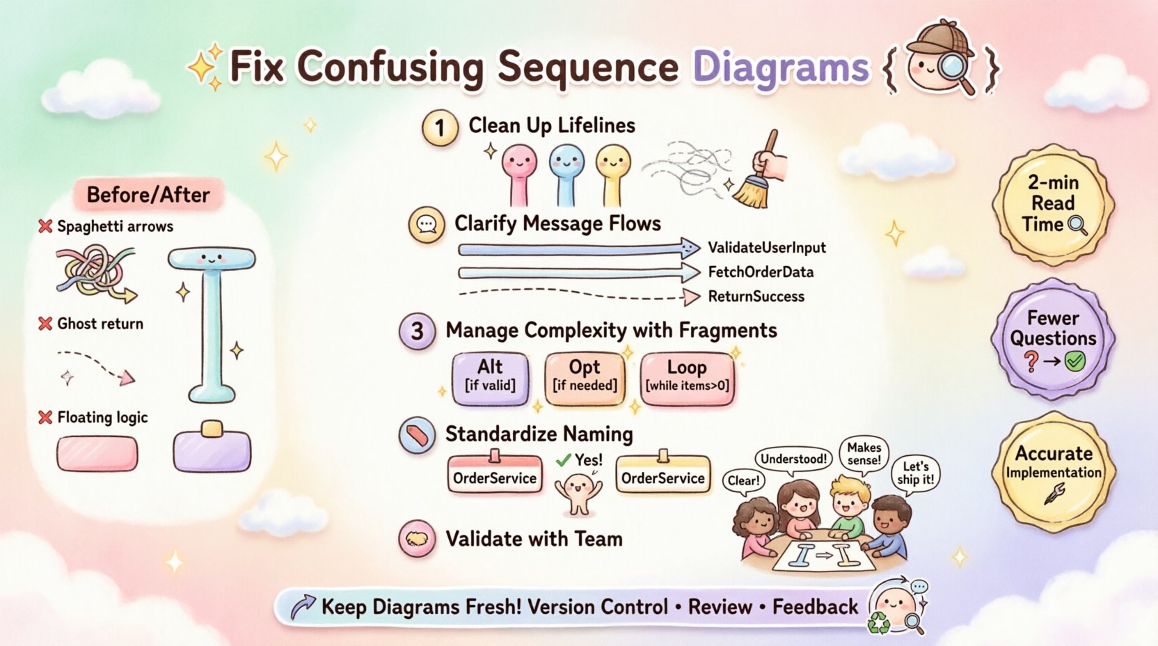
🔧 Step 1: Clean Up the Lifelines
Lifelines represent the participants in the interaction. They form the vertical axis of your diagram. If the lifelines are disorganized, the horizontal flow of messages becomes hard to follow. This is often the first place to start when troubleshooting.
📍 Reordering for Logical Flow
Place the initiating object on the far left. Arrange subsequent objects based on the frequency of their interaction or their logical grouping. For example, if a Client interacts with a Gateway, which then talks to a Database, the order should reflect that chain.
- Do: Group related actors together (e.g., all internal services on one side, external APIs on the other).
- Do: Keep the primary flow on the top or left, and secondary flows below.
- Don’t: Scatter lifelines randomly across the canvas.
- Don’t: Place the database on the left if it is the final destination of the request.
📏 Managing Lifeline Length
Activation bars (the thin rectangles on the lifeline) indicate when an object is performing an action. If activation bars are too long, they obscure other messages. If they are too short, they fail to convey duration.
- Align Activation Bars: Ensure they start exactly where the incoming message arrow touches the lifeline.
- Break Long Bars: If an object waits for a long period (e.g., external API call), break the activation bar with a gap to indicate inactivity.
- Avoid Overlap: Ensure activation bars do not overlap confusingly unless representing parallel processes.
📩 Step 2: Clarify Message Flows
Messages are the horizontal arrows connecting lifelines. They represent the actual work being done. This is where most logical errors occur.
🔄 Synchronous vs. Asynchronous
Distinguish clearly between calls that wait for a response and those that fire and forget.
- Synchronous Messages: Use a solid line with a filled arrowhead. This indicates the sender waits for the receiver to complete the task.
- Asynchronous Messages: Use a solid line with an open arrowhead. The sender continues without waiting.
- Return Messages: Use a dashed line with an open arrowhead pointing back to the sender.
If your diagram mixes these types without clear distinction, the reader cannot determine the execution model. This ambiguity is a common cause of implementation errors.
📝 Message Naming Conventions
Every arrow needs a label. A label without a verb or a noun is meaningless.
- Verb-Object Format: Use phrases like “Get User Profile” rather than “Get”.
- Consistency: If you use “Fetch” in one place, do not use “Retrieve” for the same action elsewhere.
- Parameters: If a message passes complex data, list the key parameters in parentheses (e.g., “SaveOrder(orderId)”).
Here is a comparison of common naming pitfalls:
| ❌ Poor | ✅ Improved | Why? |
|---|---|---|
| “Process” | “ValidatePaymentDetails” | “Process” is too vague. |
| “Data” | “SubmitLoginForm(username, password)” | Specifies the payload. |
| “Check” | “VerifyInventoryAvailability” | Defines the scope of the check. |
| “Send” | “DispatchNotification(email)” | Clarifies the destination type. |
🧩 Step 3: Manage Complexity with Fragments
When a sequence involves loops, conditions, or optional paths, the diagram can become a tangled web. This is where fragments come in. They allow you to group specific logic blocks.
📦 Using Alt and Opt Blocks
Alt (Alternative) blocks are for if-else logic. Opt (Optional) blocks are for conditions that may or may not occur.
- Label Clearly: Every fragment box must have a guard condition (e.g., [if valid], [else]).
- Minimize Nesting: Deeply nested fragments are hard to read. If you find yourself nesting three levels deep, consider breaking the diagram into multiple smaller diagrams.
- Define Outcomes: Ensure every branch within an Alt block leads to a defined state or return.
🔄 Loop Handling
Loops are necessary for batch processing or iteration. However, showing every single iteration makes the diagram unreadable.
- Represent Iteration: Use the Loop fragment to indicate repetition.
- Specify Count: If possible, note the condition (e.g., [while items > 0]).
- Avoid Infinite Loops: Never show a loop without an exit condition in the diagram logic.
Consider the cognitive load of the reader. If they have to trace 50 arrows to find the error condition, the design is too complex. Refactor the logic to simplify the diagram.
📝 Step 4: Standardize Naming Conventions
Consistency is key to readability. A diagram that mixes terminology confuses the reader about the system architecture.
🏷️ Participant Names
Ensure the names at the top of the lifelines match the codebase or architectural documentation. If the class is called OrderService, do not label the lifeline OrderHandler.
- Use Domain Language: Align with the business terms used by stakeholders (e.g., “Customer” instead of “User” if that is the domain term).
- Avoid Acronyms: Spell out terms unless they are universally known in the industry.
- Case Consistency: Stick to PascalCase or camelCase for all lifeline labels.
🔗 Message Consistency
Check for synonyms in message labels. If one arrow says “Create Account” and another says “Register User”, the reader must pause to understand if they are the same action.
- Global Dictionary: Maintain a glossary of action verbs for the project.
- Scope Limitation: Limit the scope of the diagram. If the diagram is about “Checkout Flow”, do not include “Login Flow” unless it is a prerequisite clearly marked.
🤝 Step 5: Validate with the Team
Even the most technically accurate diagram can fail if the team interprets it differently. Validation is the final step in troubleshooting.
👥 The Walkthrough
Schedule a session where the diagram creator explains the flow to a peer. Ask them to trace the logic without your input.
- Ask for Confusion Points: Directly ask, “Where did you get stuck reading this?”.
- Check Edge Cases: Ensure error paths are visible. Does the diagram show what happens when the database is down?
- Verify Timing: Confirm that the sequence of events matches the actual system behavior.
📋 The Checklist
Before finalizing a diagram, run through this checklist to ensure clarity.
- Are all lifelines named consistently with the code?
- Are all messages labeled with verbs?
- Are return messages dashed?
- Are all conditional blocks labeled with guards?
- Is the activation bar aligned with the message arrival?
- Are there unnecessary lifelines that can be removed?
- Is the diagram focused on a single scenario?
🛠️ Common Troubleshooting Scenarios
Below are specific situations where sequence diagrams often fail, and how to resolve them.
Scenario A: The “Spaghetti” Arrow
Problem: Messages cross each other multiple times, creating a tangled web. 🍝
Fix: Reorder the lifelines. Sometimes, moving a participant to the opposite side of the diagram resolves the crossing. Alternatively, use a Ref fragment to defer a complex sub-flow to a separate diagram.
Scenario B: The “Ghost” Return
Problem: A message is sent, but no return arrow exists, leaving the reader unsure if the call succeeded. 👻
Fix: Add a return arrow, even if it is just a dashed line. If the return is a void or null, label it [void] or [success] to indicate the outcome.
Scenario C: The “Floating” Logic
Problem: A message appears to come from nowhere or goes nowhere. ⚓
Fix: Ensure every arrow connects two lifelines. If a message is external (e.g., from a user), start the arrow from the Actor shape. If it is internal, ensure the source lifeline exists.
📉 Measuring Diagram Quality
How do you know you have fixed the confusion? Use these metrics to evaluate the improvement.
- Read Time: Can a new developer understand the flow in 2 minutes?
- Question Frequency: How many questions does the diagram generate during a review? Fewer questions mean higher clarity.
- Implementation Accuracy: Does the code written based on the diagram match the intended behavior without debugging the design?
Quality is not about how much detail you fit on the page. It is about how efficiently the information is transferred. A diagram that is too detailed becomes a manual; a diagram that is too simple becomes a sketch. The goal is the balance.
🔄 Continuous Improvement
Sequence diagrams are living documents. They should evolve as the system changes. When a feature is updated, the diagram must be updated. This prevents the “diagram rot” that occurs when documentation falls out of sync with code.
- Version Control: Treat diagrams like code. Commit changes to a repository.
- Review Process: Include diagram updates in the pull request workflow.
- Feedback Loop: Encourage team members to suggest edits if they find a diagram confusing.
By treating sequence diagrams as critical infrastructure rather than optional decoration, you ensure they remain valuable assets. Regular maintenance prevents the accumulation of confusion over time.
🧠 Cognitive Load Considerations
Understanding why diagrams fail requires understanding human cognition. The human brain processes visual patterns differently than text. Sequence diagrams leverage this, but they can also exploit cognitive weaknesses.
- Working Memory: People can only hold a few items in their working memory at once. Do not force them to track 20 concurrent interactions. Break the diagram down.
- Visual Hierarchy: Use size and color (if permitted by your tool) to highlight the critical path. Secondary paths should be visually muted.
- Pattern Recognition: Use standard symbols. Deviating from standard UML notation increases the time required to decode the diagram.
When troubleshooting, put yourself in the shoes of a reader who has never seen the system before. If they cannot infer the intent without asking, the diagram needs work.

