Sequence diagrams serve as a fundamental tool for visualizing the interaction between objects or components within a system over time. They map out the flow of messages, data, and control signals, providing a temporal view of system behavior. When executed correctly, these diagrams reduce ambiguity, align team understanding, and document complex logic in a format that is accessible to both technical and non-technical stakeholders. However, a diagram that is cluttered or poorly structured can lead to confusion rather than clarity. This guide outlines the essential standards for constructing sequence diagrams that communicate intent effectively.
🧩 Understanding the Core Components
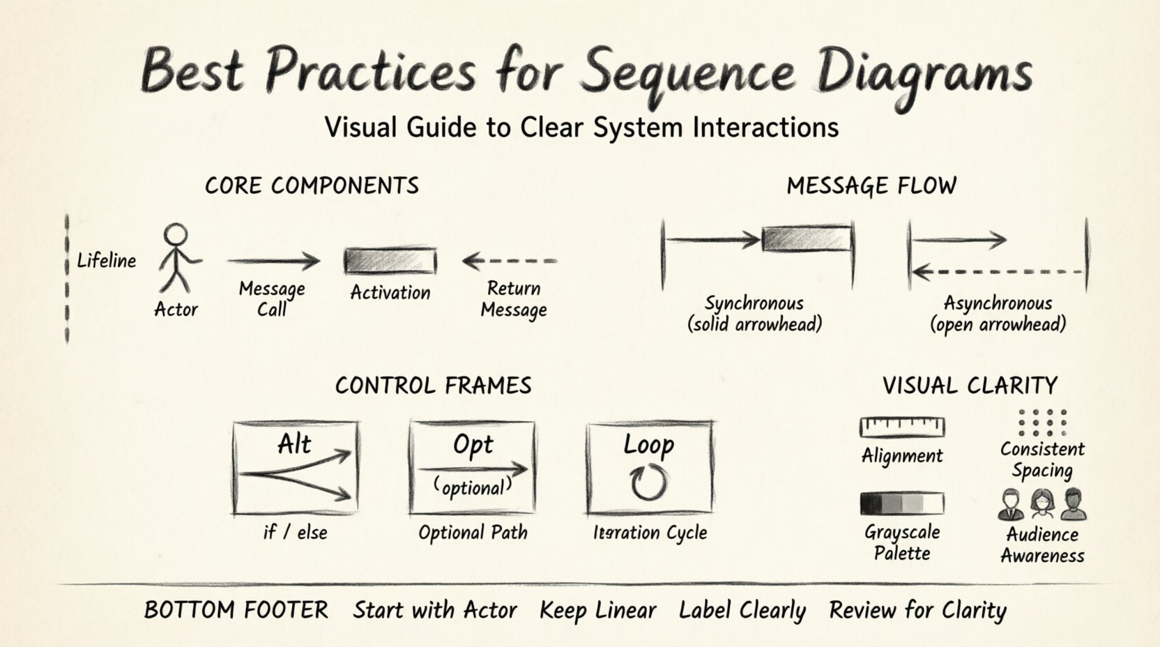
Before diving into the layout and flow, it is necessary to establish a strong foundation using the standard elements. Every sequence diagram relies on specific building blocks. Using these consistently ensures that anyone reviewing the document can interpret the logic without requiring a legend.
- Lifelines: Represent the participants in the interaction. These are typically drawn as vertical dashed lines extending from the top of the diagram to the bottom. Each lifeline represents an object, role, or subsystem.
- Actors: Represent the initiators of the process. These are often drawn as stick figures or simple icons on the left side of the diagram to indicate an external user or system triggering the sequence.
- Messages: Horizontal arrows connecting lifelines. They indicate a request, a call, or a signal sent from one participant to another.
- Activation Bars: Rectangular bars placed on the lifeline. They show the period during which the participant is actively performing an operation.
- Return Messages: Dashed arrows pointing back to the sender. These indicate the completion of a request or the return of data.
Ensure that all participants are named clearly. Avoid generic names like “Object1” or “System”. Instead, use descriptive names such as “UserSession”, “PaymentProcessor”, or “OrderRepository”. This contextual naming helps the reader immediately understand the role of each component without needing to cross-reference other documentation.
📩 Structuring Message Flows
The heart of a sequence diagram is the message flow. The way you draw and label these arrows dictates how the reader perceives the timing and nature of the interaction. Adhering to standard notation prevents misinterpretation.
1. Synchronous vs. Asynchronous Calls
Differentiate between blocking and non-blocking operations. A solid arrow head typically denotes a synchronous message, where the sender waits for a response before continuing. A stick arrow head (open arrow) often represents an asynchronous message, where the sender continues execution immediately after sending the signal.
- Synchronous: Use this when the subsequent logic depends on the result of the call.
- Asynchronous: Use this for fire-and-forget operations, such as logging or notifications, where the flow does not depend on an immediate return.
2. Handling Return Values
Do not clutter the diagram with every single return value. Only return messages that are significant to the logic or data flow. If a method returns a boolean status, you might indicate it in the label (e.g., “Returns: true”). If it returns a large object, describe it conceptually (e.g., “Returns: OrderData”).
Ensure return arrows are drawn as dashed lines. This visual distinction separates the request from the response, making the timeline easier to read. Avoid drawing return messages for internal operations that do not cross a component boundary unless necessary for debugging flow.
🔄 Managing Complexity with Control Frames
As systems grow, the sequence of interactions becomes non-linear. You will encounter scenarios involving conditions, loops, and optional behaviors. Control frames allow you to encapsulate these behaviors without breaking the linear reading flow of the diagram.
1. Alternative (Alt) Frames
Use Alt frames to represent conditional logic (if-else scenarios). Split the frame into fragments based on the condition.
- Top Fragment: The primary condition (e.g., “User is authenticated”).
- Else Fragment: The fallback condition (e.g., “User is not authenticated”).
Label each fragment clearly. Avoid nesting too many levels of Alt frames, as this creates a “spaghetti” effect that is difficult to follow. If the logic branches too deeply, consider splitting the sequence diagram into separate diagrams for each major scenario.
2. Optional (Opt) Frames
Use Opt frames for behaviors that may or may not occur based on specific criteria. This is distinct from Alt, which implies a mandatory choice between paths. For example, a “Forgot Password” link might appear only on the login screen. Represent this logic within an Opt frame to show it is an exception to the standard flow.
3. Loop Frames
When a process repeats, use a Loop frame. Instead of drawing every iteration, draw one representative interaction and enclose it in a loop frame with a condition (e.g., “For each item in cart”).
- Specify the iteration condition clearly within the frame header.
- Ensure the loop body represents a single iteration accurately.
- Avoid using loops for complex logic that changes behavior per iteration; instead, use a loop with a note explaining the variation.
🎨 Visual Clarity and Layout
A sequence diagram is a visual artifact. Its effectiveness depends heavily on how it looks. A messy diagram suggests messy code or a messy design process. Apply strict formatting rules to maintain professionalism.
1. Alignment and Spacing
Align all lifelines vertically. Ensure the horizontal position of messages corresponds to the logical flow of time. Participants should be ordered from left to right based on their frequency of interaction or logical hierarchy. The initiator should usually be on the far left.
Use consistent vertical spacing between messages. Do not bunch interactions tightly together. White space is a tool to reduce cognitive load. If two interactions happen in rapid succession, separate them slightly to distinguish the events.
2. Activation Bar Management
Activation bars indicate active processing. Do not draw them for every single message if the processing time is negligible. Focus on the activation bars that span multiple messages or cross system boundaries. This highlights where the computational effort is concentrated.
3. Color Usage
While diagrams are often monochrome in documentation, using color sparingly can enhance readability. However, ensure that color is not the only indicator of meaning. Use color to group related participants or highlight specific error paths. Always ensure the diagram is readable in grayscale for print-friendly documentation.
👥 Tailoring for Different Audiences
Not every reader requires the same level of detail. A diagram intended for a senior architect differs from one intended for a junior developer. Adjust the granularity based on the audience.
| Audience | Focus Area | Detail Level | Exclusion |
|---|---|---|---|
| Business Stakeholders | High-level workflow | Low | Database calls, API headers |
| System Architects | Component integration | Medium | Variable names, specific logic |
| Developers | Logic implementation | High | None (focus on flow) |
For business stakeholders, abstract the technical steps. Instead of “POST /api/v1/orders”, label the interaction “Create Order Request”. This keeps the focus on the business value rather than the endpoint syntax.
For developers, include method signatures where helpful. Indicate error handling paths explicitly. If a transaction rolls back, show the rollback message returning to the caller.
⚠️ Common Mistakes and Corrections
Avoiding common pitfalls is just as important as following best practices. Review your work against this checklist before finalizing the document.
- Mixing Levels of Abstraction: Do not mix high-level business actions with low-level database queries in the same diagram. This confuses the timeline. Keep database persistence logic separate from orchestration logic.
- Missing Return Messages: If a message is sent, a return message usually implies completion. Omitting this makes the flow look incomplete.
- Overcrowding Lifelines: If a lifeline has too many interactions, it becomes a “hairball”. Split the diagram into sub-processes or use notes to reference external logic.
- Unclear Time Progression: Ensure time flows strictly from top to bottom. Do not draw arrows that go upwards unless they are return messages. Diagonal arrows that do not represent messages are confusing.
- Inconsistent Naming: Ensure you do not refer to the same participant by different names (e.g., “User” vs “Client”). Consistency builds trust in the documentation.
🔄 Maintenance and Evolution
Software is rarely static. Requirements change, and features are deprecated. A sequence diagram that is not maintained becomes a liability, potentially leading to bugs when developers assume the diagram matches the code.
1. Version Control
Treat diagrams as code. Store them in the same version control system as your application. Use meaningful commit messages that explain why the diagram changed. If a diagram is updated, note the version number in the header.
2. Linking to Code
Where possible, link diagram elements to the actual implementation files. This allows developers to navigate from the visual representation to the source code. It reduces the friction between documentation and reality.
3. Regular Audits
Schedule periodic reviews of your diagrams. During code refactoring or sprint planning, verify that the diagrams still reflect the current state of the system. If a feature has been removed, update the diagram immediately to prevent confusion for new team members.
📝 Summary of Key Guidelines
To summarize, effective sequence diagrams require discipline in both design and maintenance. They are not just drawings; they are contracts between the system and the people who build or maintain it. By adhering to the following principles, you ensure your documentation adds value rather than noise.
- Start with the Actor: Always establish who initiates the process.
- Keep it Linear: Time should flow vertically without crossing back up, except for returns.
- Limit Depth: Avoid deep nesting of Alt and Loop frames. Break complex logic into multiple diagrams.
- Label Clearly: Every arrow and box should have a descriptive label.
- Review for Clarity: Ask a colleague to read the diagram without context. If they cannot understand the flow, simplify it.
Investing time in creating high-quality sequence diagrams pays dividends in reduced debugging time, faster onboarding for new developers, and fewer architectural misunderstandings. A clear diagram is a silent agreement that everyone understands the system in the same way.

